FlexContainer Methods
FlexContainer widget has the following methods associated with it:
add Method
This method is used to add widgets to the FlexContainer. When the widgets are added to the current visible FlexContainer, then the changes will reflect immediately. Adding a widget to the FlexContainer hierarchy, which is already a part of the other widget hierarchy, will lead to undefined behaviors. You have to explicitly remove the widget from one hierarchy before adding it to another FlexContainer.
Syntax
add(widgetArray)
Parameters
widgetArray [JSObject]
Comma separated list of widgets.
Return Values
None
Exceptions
WidgetError
Example
//Sample code to invoke add method by using a FlexContainer widget.
var myButton = new voltmx.ui.Button({
 "focusSkin": "defBtnFocus",
 "height": "50dp",
 "id": "myButton",
 "isVisible": true,
 "left": "71dp",
 "skin": "defBtnNormal",
 "text": "Button",
 "top": "93dp",
 "width": "300dp",
 "zIndex": 1
}, {
 "contentAlignment": constants.CONTENT_ALIGN_CENTER,
 "displayText": true,
 "padding": [0, 0, 0, 0],
 "paddingInPixel": false
}, {});
myForm.myFlexContainer.add(myButton);
Platform Availability
- iOS
- Android
- Windows
- SPA
addAt Method
This method is used to add widgets to the FlexContainer at the specified index. Widget is prepended if index <0 and appended at the end of the container if the index > size+1. Size is the number of widgets already present in the container. If a new widget is added or removed will reflect immediately from the form hierarchy model perspective, however the changes are displayed when the FlexContainer appears. When the widgets are added to the current visible FlexContainer, then the changes will reflect immediately. Adding a widget to the FlexContainer hierarchy, which is already a part of the other widget hierarchy, will lead to undefined behaviors. You have to explicitly remove the widget from one hierarchy before adding it to another FlexContainer.
Syntax
addAt(widgetref, index, animation)
Parameters
widgetref
Reference of the name of the widget.
index [Number]
Index number at which the widget is to be added.
animation
Optional. This parameter is used to associate an animation at given operation.
The animation parameter has three parameters:
definition
An object defined using voltmx.ui.createAnimation() API. Refer to voltmx.ui.createAnimation in the API programmers Guide for more details.
config
As defined in Animation Configuration. For more information, please see the AnimationConfiguration object documentation in the API Developer's Guide.
Return Values
None
Exceptions
WidgetError
Example
//Sample code to invoke addAt method by using a FlexContainer widget.
//Here, myFlexContainer is a flexcontainer inside myForm form.

var btn1 = new voltmx.ui.Button({
 "focusSkin": "defBtnFocus",
 "height": "50dp",
 "id": "btn2",
 "isVisible": true,
 "left": "77dp",
 "skin": "defBtnNormal",
 "text": "Checking",
 "top": "19dp",
 "width": "260dp",
 "zIndex": 1
}, {
 "contentAlignment": constants.CONTENT_ALIGN_CENTER,
 "displayText": true,
 "padding": [0, 0, 0, 0],
 "paddingInPixel": false
}, {});
myForm.myFlexContainer.addAt(btn1, 1);
Platform Availability
- iOS
- Android
- Windows
- SPA
addGestureRecognizer Method
This API allows you to set a gesture recognizer for a specified gesture for a specified widget.
Syntax
addGestureRecognizer(gestureType, gestureConfigParams, onGestureClosure)
Parameters
gestureType
[Number] - Mandatory
Indicates the type of gesture to be detected on the widget.
See Remarks for possible values.
gestureConfigParams
[object] - Mandatory
The parameter specifies a table that has the required configuration parameters to setup a gesture recognizer.
The configuration parameters vary based on the type of the gesture.
See Remarks for possible values.
onGestureClosure
[function] - Mandatory
Specifies the function that needs to be executed when a gesture is recognized.
This function will be raised asynchronously
See Remarks for the syntax of this function.
Return Values
String - Reference to the gesture is returned.
Remarks
The values for the _gestureType_parameter are:
[Number] - Mandatory
Indicates the type of gesture to be detected on the widget. The following are possible values:
- 1 – constants.GESTURE_TYPE_TAP
- 2 - constants.GESTURE_TYPE_SWIPE
- 3 – constants.GESTURE_TYPE_LONGPRESS
- 4 – constants.GESTURE_TYPE_PAN
- 5 – constants.GESTURE_TYPE_ROTATION
- 6 - constants.GESTURE_TYPE_PINCH
- 7 - constants.GESTURE_TYPE_RIGHTTAP
The values for the _gestureConfigParams_parameter are:
[object] - Mandatory
The parameter specifies a table that has the required configuration parameters to setup a gesture recognizer. The configuration parameters vary based on the type of the gesture.
This parameter supports the following key-value pairs:
Gesture Type:TAP
- fingers [Number] - specifies the maximum number of fingers that must be respected for a gesture. Possible values are: 1. Default value is 1.
- taps [Number] - specifies the maximum number of taps that must be respected for a gesture. Possible values are: 1 or 2. Default value is 1.
For example:
{fingers:1,taps:1}
Gesture Type:SWIPE
- fingers [Number] - specifies the maximum number of fingers that must be respected for a gesture. Possible values are: 1. Default value is 1.
For example:
{fingers: 1}
Gesture Type:LONGPRESS
- pressDuration [Number] - specifies the minimum time interval (in seconds) after which the gesture is recognized as a LONGPRESS. For example, if pressDuration is 2 seconds, any continued press is recognized as LONGPRESS only if it lasts for at least 2 seconds. Default value is 1. This is not applicable to Windows.
For example:
{pressDuration=1}.
Gesture Type: PAN
- fingers [number] specifies the minimum number of fingers needed to recognize this gesture. Default value is 1.
- continuousEvents [Boolean] indicates if callback should be called continuously for every change beginning from the time the gesture is recognized to the time it ends.
Gesture Type: ROTATION
- Rotation gesture involves only two fingers.
- continuousEvents [Boolean] indicates if callback must be called continuously for every change beginning from the time the gesture is recognized to the time it ends.
Gesture Type:PINCH
- Pinch gesture invloves two fingures.
- continuousEvents [Boolean] indicates if callback should be called continuously every change beginning from the time the gesture is recognized to the time it ends.
The syntax for the _onGestureClosure_callback function are:
[function] - Mandatory
Specifies the function that needs to be executed when a gesture is recognized.
This function will be raised asynchronously and has the following Syntax:
onGestureClosure(widgetRef, gestureInfo, context)
- widgetRef - specifies the handle to the widget on which the gesture was recognized.
- gestureInfo - Table with information about the gesture. The contents of this table vary based on the gesture type.
- context - Table with SegmentedUI row details.
gestureInfo table has the following key-value pairs:
- gestureType [number] – indicates the gesture type; 1 for TAP, 2 for SWIPE, and 3 for LONGPRESS,4 for PAN, 5 for ROTATION, 6 for PINCH and 7 for RIGHTTAP
- gesturesetUpParams [object] – specifies the set up parameters passed while adding the gesture recognizer
- gesturePosition [number] – indicates the position where the gesture was recognized. Possible values are: 1 for TOPLEFT, 2 for TOPCENTER, 3 for TOPRIGHT, 4 for MIDDLELEFT, 5 for MIDDLECENTER, 6 for MIDDLERIGHT, 7 for BOTTOMLEFT, 8 for BOTTOMCENTER, 9 for BOTTOMRIGHT, 10 for CENTER
- swipeDirection [number] –indicates the direction of swipe. This parameter is applicable only if the gesture type is SWIPE. Possible values are: 1 for LEFT, 2 for RIGHT, 3 for TOP, 4 for BOTTOM. Direction is w.r.t the view and not device orientation.
- gestureX [number] – specifies the X coordinate of the point (in pixels) where the gesture has occurred. The coordinate is relative to the widget coordinate system.
- gestureY [number] – specifies the Y coordinate of the point (in pixels) where the gesture has occurred. The coordinate is relative to the widget coordinate system.
- widgetWidth [number] – specifies the width of the widget (in pixels)
- widgetHeight [number] – specifies the height of the widget (in pixels)
- gestureState[number] – indicates the gesture state as below
- 1 – gesture state begin
- 2 - gesture state changed
- 3 – gesture state ended.
- * gestureState is applicable only for continuous gestures like PAN, ROTATION and PINCH.
- rotation [number] rotation of the gesture in degrees since its last change.( Applicable only when gesture type is ROTATION
- velocityX and velocityY : horizontal and vertical component of velocity expressed in points per second. (Applicable only for PAN gesture type)
- velocity [number]: velocity of pinch in scale per second (Applicable for Pinch gesture)
- scale [number]:scale factor relative to the points of the two touches in screen coordinates
- touchType[number]:(windows only)
- 0 - constants.TOUCHTYPE_FINGER
- 1 - constants.TOUCHTYPE_PEN
- 2 - constants.TOUCHTYPE_MOUSE
-
translationX and translationY [number] : cumulative distance as number. (Applicable only for PAN gesture type) context table has the following key-value pairs:
-
rowIndex [number] : row index of the segui where gesture was recognised. (Applicable to gestures added to segUI rows)
- sectionIndex [number] : section index of the segui where gesture was recognised. (Applicable to gestures added to segUI rows)
It is not recommend to define gestures for widgets that have a default behavior associated with it.
If you click (tap) a button (any clickable widget), the default behavior is to trigger an onClick event. If you define a Tap gesture on such widgets, the gesture closure is executed in addition to the onClick event.
If you swipe a larger form, the default behavior is to scroll up and down depending on the direction in which you swipe. If you define a SWIPE gesture on such forms, the gesture closure gets executed in addition to scrolling the form.
If you swipe a Segmented UI with huge number of rows, the default behavior is to scroll the Segmented UI. If you define a SWIPE gesture on such segments, the gesture closure gets executed in addition to scrolling the form.
Gestures can be added only for the following widgets:
- Form (deprecated)
- HBox (deprecated)
- VBox (deprecated)
- Scrollable Box (deprecated)
- Flex Container
- Flex Scroll Container.
In the android platform, the top and bottom gestures work only when the scrolling is disabled for Form and parent scrolling containers. By default, the scrolling is enabled for the Form and scrolling containers.
- RIGHTTAP applicable only to Windows 10
- ROTATION is not supported on android.
Example
//Sample code to add Gestures to myFlexContainer FlexContainer.
//Code to add DOUBLE TAP gesture to the frmGestures, FlexForm.
var doubletp = {
 fingers: 1,
 taps: 2
};
frmGestures.addGestureRecognizer(1, doubletp, onGestureFunction);
//Code to add SINGLE TAP gesture to the frmGestures FlexForm.
var singleTp = {
 fingers: 1,
 taps: 1
};
frmGestures.myFlexContainer.addGestureRecognizer(1, singleTp, onGestureFunction);
//Code to add SWIPE gesture to the frmGestures FlexForm.
var swipeForm = {
 fingers: 1,
 swipedistance: 50,
 swipevelocity: 75
};
frmGestures.myFlexContainer.addGestureRecognizer(2, swipeForm, onGestureFunction);
//Code to add LONGPRESS gesture to the frmGestures FlexForm.
var longPressForm = {
 pressDuration: 2
};
frmGestures.myFlexContainer.addGestureRecognizer(3, longPressForm, onGestureFunction);

function onGestureFunction(commonWidget, gestureInfo) {
 voltmx.print("The Gesture type is:" + gestureInfo.gestureType);

}
Platform Availability
- iOS, Android, Windows
animate Method
Applies an animation to the widget.
Syntax
animate (animationObj, animateConfig, animationCallbacks)
Parameters
animationObj
An animation object created using [voltmx.ui.createAnimation] function.
animationConfig
As defined in widget level animation section.
animationCallbacks
A JavaScript dictionary that contains key-value pairs. The following keys are supported.
| Key | Description |
|---|---|
| animationEnd | A JavaScript function that is invoked with the animation ends. For more information, see the Remarks section below. |
| animationStart | A JavaScript function that is invoked with the animation starts. For more information, see the Remarks section below. |
Return Values
Returns a platform-specific handle to the animation. This handle currently not used, but is returned for possible future requirements use.
Remarks
The callback for the animationStart key in the JavaScript object passed in this method's animationCallbacks parameter has the following signature.
animationStart(source, animationHandle, elapsedTime);
where source is the widget being animated, animationHandle is the handle returned by the applyAnimation method, and elapsedTime is the amount of time the animation has been running in seconds, when this event is fired..
This event occurs at the start of the animation. If there is 'animation-delay' configured then this event will fire only after the delay period. This event gets called asynchronously.
The callback for the animationEnd key in the JavaScript object passed in this method's animationCallbacks parameter has the following signature.
animationEnd(source, animationHandle, elapsedTime);
where source is the widget being animated, animationHandle is the handle returned by the applyAnimation method, and elapsedTime is the amount of time the animation has been running in seconds, when this event is fired.
This event occurs at the end of the animation. This event gets called asynchronously.
The animate method throws an Invalid Animation Definition Exception if animation definition, does not follow the dictionary structure expected. This method is ignored if it is called on a widget whose immediate parent is not FlexContainer or a FlexScrollContainer.
If the widget is not part of the currently visible view hierarchy, calling this method does nothing. Because this method is asynchronous and immediately returns, it does not wait for the animation to start or complete.
Example
//Sample code of animation
function AnimateBoth() {
    var getFuncName = frm1.listbox18.selectedKey;
    if (getFuncName == "BothLT") {
        frm1.textbox26.animate(myAnimDefinition(),
            animConfiguration(), {});
    } else if (getFuncName == "BothTBL") {
        frm1.textbox26.animate(myAnimDefinitionsc1(),
            animConfiguration(), {});
    }
}
Platform Availability
- iOS, Android, Windows, and SPA
clone Method
When this method is used on a container widget, then all the widgets inside the container are cloned. This method takes an optional parameter. If the widgetid is not passed then the cloned copy will have the same ID as original widget.
If the widget ID is passed as a parameter then it will be prefixed to the existing ID and will assign it to cloned copy of the container. For all other widgets of the container and its child widgets.
For example, if the widget ID is "fc1" and the widget ID passed to clone API is "ref1", then the cloned widget ID will be "ref1fc1". For a child widget placed in a container with widget ID as "wid1", the cloned copy will have the widget ID as "ref1wid1".
Exceptions are not displayed if widget ID parameter is not unique. Instead when the cloned copy is added to the same form as of original container then it may lead to unexpected behaviors. So it is your responsibility to provide unique widget ID.
Syntax
clone()
Parameters
widgetId [String]
Optional. Reference of the name of the widget.
Return Values
Cloned copy of the widget.
Exceptions
None
Remarks
- This method is not supported on SegmentedUI2 widget.
- Gestures for the FlexContainer are not cloned. You have to reapply the gestures on the cloned object.
- In Android platform, cloned Map widget will not work if prefix is not passed as parameter to the API.
- To apply focusSkin for dynamically created widgets or cloned widgets, assign focusSkin dynamically after adding the widget to the form hierarchy. This is applicable for SPA and Desktop web platforms.
formid.widgetid.focusSkin = "skinname"; ```
*   To apply hoverSkin for dynamically created widgets or cloned widgets, assign hoverSkin dynamically after adding the widget to the form hierarchy. This is applicable for the Desktop web platform. ```
formid.widgetid.hoverSkin = "skinname"; ```

### Example
//This is a generic method that is applicable for various widgets.
//Here, we have shown how to use the clone Method for a FlexContainer widget.
//You need to make a corresponding call of the clone method for other applicable widgets.
var flex2 = frmFlex.flexContainer1.clone();
//Here, flexContainer1 is a FlexContainer widget that is already present in frmFlex FlexForm.
frmFlex.add(flex2);
//For instance, the corresponding clone method call on the Label widget is as follows:
var myLabel=frmFlex.lbl1.clone();
### Platform Availability

*   iOS, Android, Windows, and SPA

* * *

</details>
<details close markdown="block"><summary>convertPointFromWidget Method</summary>

* * *

This method allows you to convert the coordinate system from a widget to a point (receiver's coordinate system).

### Syntax
convertPointFromWidget(point, fromWidget)
### Parameters

**_point_**

\[JSObject\]- Mandatory

You can specify an object with keys as x and y. You can specify the values in all (dp, px and %) units of measurement.

**_fromWidget_**

\[widgetref\]- Mandatory

This parameter is the handle to the widget instance. Based on this parameter, the coordinate system is converted from the widget to a point (receiver's coordinate system).

### Example
Form1.widget1.convertPointFromWidget({ x: "10dp", y: "20dp" }, widget2);
### Platform Availability

*   iOS, Android, Windows, and SPA

* * *

</details>
<details close markdown="block"><summary>convertPointToWidget Method</summary>

* * *

Using the convertPointToWidget method, you can modify the co-ordinate system. You can convert the receiver's co-ordinate system from a **point** to a **Widget**.

### Syntax
convertPointToWidget(point, toWidget)
### Parameters

**_point_**

\[JSObject\]- Mandatory. You can specify an object with keys as x and y. You can specify the values in all (dp, px and %) units of measurement.

**_toWidget_**

\[widgetref\] - Mandatory. This parameter is the handle to the widget instance. Based on this parameter, the coordinate system is converted from a point to a widget.

### Example
Form1.widget2.convertPointToWidget({ x: "20dp", y: "30dp" }, widget1);
### Platform Availability

*   iOS, Android, Windows, and SPA

* * *

</details>
<details close markdown="block"><summary>forceLayout Method</summary>

* * *

When this method is called, underlying OS layout cycle is forced to layout the widgets of the FlexContainer. FlexContainer does not issue layout as and when layout changes happen to the widgets inside FlexContainer.

### Syntax
forceLayout()
### Parameters

None

### Return Values

None

### Exceptions

WidgetError

### Remarks

> **_Note:_** This method asynchronously forces the layout while method returns immediately.

The layout cycles of a FlexContainer are triggered automatically in the below cases:

*   Except in Android, at the end of JavaScript closure execution, if there are changes in the widgets of currently visible view hierarchy, that require layout cycles.
*   When a form and other top-level containers marked as FlexContainer get visible.
*   When there is a change in view hierarchy (addition or removal of widgets in the view hierarchy)
*   When a container size is changed, its layout is triggered or when device orientation is changed.
*   When you force the layout of the FlexContainer as needed using the forceLayout method.

Changing the widget layout properties does not mean layout cycles are automatically triggered. Layout manage can choose to cache the positions and dimensions of the widgets inside FlexContainer for performance reasons and reuse all valid cache values during the layout cycles.

The forceLayout should be called on the parent only when any of the positional or dimensional properties of any child widgets are modified. Other properties such as zIndex, backgroundColor, transform, and visibility does not need a forceLayout call.

**When to Use**

Case1: If you have a SegmentedUI inside a FlexForm and you want to change the SegmentedUI layout properties dynamically. In this case you have to call the forceLayout after configuring the new layout properties.

### Example
//Sample code to invoke forceLayout method by using a FlexContainer widget.
myForm.myFlexContainer.forceLayout();
### Platform Availability

*   iOS, Android, Windows, SPA, and Desktop Web

* * *

</details>
<details close markdown="block"><summary>getBadge Method</summary>

* * *

This API enables you to read the badge value (if any) attached to the specified widget. If the specified widget does not have a badge attached to it, it returns an empty string.

### Syntax
getBadge()
Optional Parameter

**_uniqueIdentifier_**

Unique identifier of a widget which is a handle to the widget.

### Return Values

Returns a string containing the badge value applied to the specified widget. If the specified widget has no badge value attached to it, it returns an empty string.

### Remarks

When a badge is removed, the widgets are re-formatted to accommodate the cleared badge values.

On the iOS platform, this method is applicable on Label, Button, Image, TextBox, and TextArea widgets only.

### Example
//This is a generic method that is applicable for various widgets. //Here, we have shown how to use the getBadge Method for button widget. //You need to make a corresponding call of the getBadge method for other applicable widgets. function getBadge() { //To get a badge value on a Button with ID btn1 placed on a form frm1, use the following snippet: var badgeVal = frm1.btn1.getBadge(); alert("badge value is::" + badgeVal);
//For instance, the corresponding getBadge method call on the Label widget is as follows:
frm1.lbl1.getBadge();
}
### Platform Availability

*   iOS

* * *

</details>
<details close markdown="block"><summary>registerForPeekandPop Method</summary>

* * *

This method registers a widget to enable 3D Touch peek and pop gestures.

### Syntax
registerForPeekandPop(onPeekCallback, onPopCallback)
### Parameters

**_onPeekCallback_**

A callback function that is invoked when the user slightly presses (soft press) the widget.

Callback Syntax
onPeekCallback(widget)
Callback Input Parameters

**_widget_**

A widget reference that is registered for peek and pop.

Callback Return Values

  A PreviewInfoTable. See the Remarks section for a description of this table.

Callback Example
function onPeekCallback(widget) { var previewInfoTable = { "peekForm": frmSecond, "focusRect": [0, 0, 200, 200], "contentSize": [320, 480] }; return previewInfoTable; }
**_onPopCallback (Optional)_**

A callback function that is invoked when the user further presses (hard press) the preview that is displayed for the widget.

Callback Syntax
onPopCallback(widget,peekForm)
Callback Input Parameters

**_widget_**

A widget reference that is registered for peek and pop.

**_peekForm_**

A form reference that is displayed as preview/peek.

Callback Return Values

  A form reference.

Callback Remarks

Use this callback to set the content for pop. The form handle returned by this callback is used for pop content. In general, the form that is used for preview is used for pop content also. If the pop callback is not implemented, peek disappears and the app returns to its previous state.

Callback Example
function onPopCallback(widget, peekForm) { // preview form used for pop also return peekForm; }
Remarks

A PreviewInfoTable has the following format.

**Name:** peekForm

**Description:** The form reference that will be displayed as preview. If an invalid form reference is given, the preview will not be shown.

**Type:** form reference

**Name:** focusRect (Optional)

**Description:** An array representing a rectangle in widgets view coordinates. If provided, this rectangle will be focused while its surrounding area will be blurred, indicating a preview is available for the widget. If not provided, entire view area of the widget will be focused. If either the width or height is zero, the widget's view width/height is used. The values are supported in percentage(with regard to widget bounds), dp, or pixels. The values are strings. If a string value is given without any format specifier, it defaults to dp. If an array of numbers is given, it is assumed they are dp values.

**Type:** Array \[x, y, width, height\]

Example: \[“0dp”, “0dp”, “200dp”, “300dp”\], \[“10%”, “10%”, “75%”, “50%”\], \[“10px”, “10px”, “200px”, “480px”\]

**Name:** contentSize (Optional)

**Description:** An array representing the preferred content size of the preview. This allows the user to adjust the preferred width/height dimensions of the preview. If not provided, the preview is shown with default values. If either the width or height is zero, the default preview width/height is used. It is recommended that one of the width/height values be zero for proper adjustment of the other value. For example, if width = 0, the height is adjustable and vice versa. Providing positive values simultaneously for both width and height will result in distorted appearance of preview. The values are supported in dp, pixels, and percentage(with regard to screen bounds). The actual width/height of the preview may vary slightly due to resizing per aspect ratio. The values are strings. If a string value is given without any format specifier, it defaults to dp. If array of numbers is given, it is assumed they are dp values.

**Type:** Array \[width, height\]

Example: \[“0dp”, “100dp”\], \[“100%”, “0%”\], \[“0px”, “240px”\]

Example of a PreviewInfoTable:
var previewInfoTable = { "peekForm": frmSecond, "focusRect": [0, 0, 200, 200], "contentSize": [320, 480] };
### Return Values

None.

### Platform Availability

*   iOS 9.0 and later

* * *

</details>
<details close markdown="block"><summary>remove Method</summary>

* * *

This method removes a widget from the form container. If a widget is removed from a form, will reflect immediately from the Form hierarchy model perspective; however the changes are displayed when the Form appears. When the widgets are removed from the current visible Form, then the changes will reflect immediately.

### Syntax
remove(widgetref)
### Parameters

**_widgetref_**

Reference of the name of the widget.

formid \[widgetref\]

Handle to the widget instance.

### Return Values

The current Form handle is returned.

### Example
//Sample Code to invoke remove method by using a FlexContainer widget.
/In this example, the myFlexContainer FlexContainer invokes remove method to delete myButton button./
myForm.myFlexContainer.remove(myForm.myFlexContainer.myButton);
### Exceptions

WidgetError

### Platform Availability

*   iOS, Android, Windows, and SPA

* * *

</details>
<details close markdown="block"><summary>removeAt Method</summary>

* * *

This method removes a widget at the given index from the Form container. If a widget is removed from the form, will reflect immediately from the Form hierarchy model perspective; however the changes are displayed when the Form appears. When the widgets are removed from the current visible Form, then the changes will reflect immediately.

### Syntax
removeAt(index)
### Parameters

index \[Number\]

Specifies the position in number format.

**_animation_**

Optional. This parameter is used to associate an animation at given operation.

The animation parameter has three parameters:

**_definition_**

An object defined using voltmx.ui.createAnimation() API. Refer to voltmx.ui.createAnimation in the API programmers Guide for more details.

**_config_**

As defined in Animation Configuration. For more information, please see the `AnimationConfiguration` object documentation in the [API Developer's Guide](../../iris_api_dev_guide/content/animationapi.md).

**_callbacks_**

A dictionary that represents JavaScript functions that work as animation call backs. For more information, see `AnimationConfiguration` object documentation in the [API Developer's Guide](../../../Iris/iris_api_dev_guide/content/introduction.md).

### Return Values

Reference of the name of the widget to be removed.

### Example
/Sample code to invoke the removeAt method without animation. In this sample code, the removeAt method deletes the data from the 15th Index position for a Segment widget./
frmSegment.mySegment.removeAt(15);
/Sample code to invoke the removeAt method with animation to deletes the data from the 15th Index position for a Segment widget./
frmSegment.mySegment.removeAt (15, animation);
### Exceptions

WidgetError

### Remarks

> **_Note:_** If the index is not within the limits then _removeAt_ will be silent and doesn't yield any result.

### Platform Availability

*   iOS, Android, Windows, and SPA

* * *

</details>
<details close markdown="block"><summary>removeAll Method</summary>

* * *

This method removes all the widget on the container.

### Syntax
removeAll()
### Parameters

None

### Return Values

None

### Example
//This is a generic method that is applicable for various widgets. //Here, we have shown how to invoke the clone Method for a CollectionView widget.
frmCollection.myCollection.removeAll();
### Exceptions

WidgetError

### Platform Availability

*   iOS, Android, Windows, and SPA

* * *

</details>
<details close markdown="block"><summary>removeFromParent Method</summary>

* * *

This method allows you to remove a child widget from a parent widget.

### Syntax
removeFromParent()
### Read/Write

Yes - (Read and Write)

### Example
//This is a generic method that is applicable for various widgets. //Here, we have shown how to use the removeFromParent Method for a Calendar widget. //You need to make a corresponding call of the removeFromParent method for other applicable widgets.
Form1.calendar.removeFromParent();
### Platform Availability

*   iOS, Android , Windows, SPA, and Desktop Web

* * *

</details>
<details close markdown="block"><summary>removeGestureRecognizer Method</summary>

* * *

This method allows you to remove the specified gesture recognizer for the specified widget.

### Syntax
removeGestureRecognizer(gestureHandle)
### Parameters

gestureHandle - Mandatory

Specifies the handle to the gesture returned by addGestureRecognizer call.

### Example
//Sample code to remove Double tap gesture from frmGestures FlexForm.
frmGestures.removeGestureRecognizer(doubletp);
### Platform Availability

*   iOS, Android, Windows, and SPA

* * *

</details>
<details close markdown="block"><summary>setBadge Method</summary>

* * *

This method enables you to set the badge value to the given widget at the upper, right corner of the widget.

### Syntax
setBadge(badgeText)
### Parameters
badgeText \[String\] - Mandatory
Specifies the Text value that appears within the badge. If the length of the badgeText is greater than 1, the badge is a rounded rectangle. For example, if you specify the text of the badge as 88, the number appears in a rounded rectangular badge. If the length of the badge text is 1, the badge is always a circle. The badge can occupy up to 70% of the width of the parent widget. For example, on a button with a width of 100 pixels, a badge with about 100 characters will occupy only 70 pixels of the button width. The badge text is truncated and shows about 30 characters followed by three dots.
skin \[String\] - Optional
The parameter specifies the background color for the badge. The default color is red.
### Return Values
None
### Exceptions
Error
### Remarks
The color for the badge can be defined using a skin. The default color for the badge is red with white lettering.
If you pass an empty string as a parameter, the badge applied to the widget is cleared.
A Badge can be applied only to the FlexContainer Widget. To apply badge to other widgets, place the corresponding widget inside the FlexContainer, then apply Badge to the FlexContainer Widget. Also make sure that the clipBounds property of the FlexContainer are set to false.
If the badge value is a single character (a character or a number), the badge shape is a circle.
If the badge value contains multiple characters, the badge shape is a rectangle with rounded corners and borders.
The badge can occupy a maximum of 70% width of the parent widget (widget on which badge is applied). For example, on a button with a width of 100 pixels, a badge with about 100 characters will occupy only 70 pixels of the button width. The badge value is truncated and about 30 characters followed by three dots.
When a badge is set, the widgets are re-arranged to accommodate the badge.
For iOS platform, this method is applicable on Box, Label, and Image widgets only.
For Android platform, this method is applicable on Button and Image widgets only.
### Example
//This is a generic method that is applicable for various widgets. //Here, we have shown how to use the setBadge Method for button widget. //You need to make a corresponding call of the setBadge method for other applicable widgets. function setBadge() { /To set a badge value with skin "badgeSkin" on a button btn1 placed on a form frm1, use the following code: / frm1.btn1.setBadge("2", "badgeSkin"); } //For instance, the corresponding setEnabled method call on the Label widget is as follows: form.lbl1.setBadge("4", "badgeSkin");
### Platform Availability

*   iOS

For more information about the badge APIs refer the _API Reference Document_.

* * *

</details>
<details close markdown="block"><summary>setDefaultUnit Method</summary>

* * *

Specifies the default unit to be used for interpretation of numbers with no qualifiers when passed to layout properties.

It is assumed that all the unqualified numbers specified for child widget layout properties and parent widget layout properties to follow the default unit specified.

### Syntax
setDefaultUnit(unit)
### Parameters

unit - (Mandatory): Specifies the position in number format.Following are the options:

  *   voltmx.flex.DP: Specifies the values in terms of device independent pixels.
  *   voltmx.flex.PX: Specifies the values in terms of device hardware pixels.
  *   voltmx.flex.PERCENTAGE(Default): Specifies the values in percentage relative to the parent dimensions.

### Return Values

None

### Exceptions

WidgetError

### Remarks

> **_Note:_** Irrespective of the number of times this method is called, system picks up the default unit configured through this method just before the layout triggers.

### Example
//Sample Code to invoke setDefaultUnit method by using a FlexContainer widget.
myForm.myFlexContainer.setDefaultUnit(voltmx.flex.PX);
### Platform Availability

*   iOS
*   Android
*   Windows
*   SPA

* * *

</details>
<details close markdown="block"><summary>setEnabled Method</summary>

* * *

This method specifies the widget that must be enabled or disabled.

### Syntax
setEnabled(enabled)
### Parameters

**_enabled_**

\[Boolean\] - Mandatory

true -Indicates widget is enabled.

false - Indicates widget is disabled.

### Return Values

None

### Exceptions

Error

### Remarks

Browser widget does not support this method in SPA.

This method is not applicable in Map widget.

### Example
//This is a generic method that is applicable for various widgets. //Here, we have shown how to use the setEnabled Method for button widget. //You need to make a corresponding call of the setEnabled method for other applicable widgets.
form1.myButton.setEnabled(false);
### Platform Availability

Available on all platforms except SPA.

* * *

</details>
<details close markdown="block"><summary>setFocus Method</summary>

* * *

This method specifies the widget on which there must be focus.

**Default :** true

### Syntax
setFocus(focus)
### Parameters

**_focus_ \[Boolean\]**- Mandatory

true -Indicates focus is set on a widget.

false - Indicates focus is not set on a widget.

### Return Values

None

### Exceptions

Error

### Remarks

You should not call this method in **preShow** of a form as it is not respected by all platforms. In android platform, this method is not respected in **preShow** of a form. You can give focus to a particular widget only after it is rendered on the screen, hence it should be called in postShow of a form.

This method is not applicable in Form widget.

### Example
//This is a generic method that is applicable for various widgets. //Here, we have shown how to use the setFocus Method for button widget. //You need to make a corresponding call of the setFocus method for other applicable widgets.
form1.myButton.setFocus(true);
### Platform Availability

Available on all platforms.

* * *

</details>
<details close markdown="block"><summary>setGestureRecognizer Method</summary>

* * *

This method allows you to set a gesture recognizer for a specified gesture for a specified widget. You can set a Gesture recognizer only for a Form, a Box, and a Scroll Box. The setGestureRecognizer method is deprecated and should not be used in new software. However, Swipe Distance and Swipe Velocity parameters are not deprecated. So if you want to use the Swipe Distance and Swipe velocity parameters, use the setGestureRecognizer method. To use all other parameters, you must use the addGestureRecognizer method.

### Syntax
setGestureRecognizer (gestureType,setupParams,gestureHandler)
### Parameters

**_gestureType_**

\[Number\] - Mandatory

Specifies the type of gesture that needs to be detected on the widget. The following are possible values:

*   1 for TAP
*   2 for SWIPE
*   3 for LONGPRESS

**_setupParams_**

\[array of arrays\] - Mandatory

The parameter specifies an object that has the configuration parameters to setup a gesture recognizer. See Remarks for the values for this parameter.

**gestureHandler**

\[function\] - Mandatory

The parameter specifies the function that needs to be executed when a gesture is recognized. See Remarks for the functions syntax.

onGesturefunction(widgetRef,gestureInfo)

*   **_widgetRef_** - This parameter specifies the handle to the widget on which the gesture was recognized.
*   **_gestureInfo_** - This parameter specifies an array that provides information about the gesture. The contents of this array vary based on the gesture type.

Volt MX Iris populates the details in the _gestureInfo_ array. This array has the following key-value pairs:

*   **_gestureType_** \[number\] - indicates the gesture type; **1** for TAP, **2** for SWIPE, and **3** for LONGPRESS.
*   **_gesturesetUpParams_** \[object\] - this array is the set up parameters passed while adding the gesture recognizer.
*   **_gesturePosition_** \[number\] - indicates the position where the gesture was recognized. Possible values are: **1** for TOPLEFT, **2** for TOPCENTER, **3** for TOPRIGHT, **4** for MIDDLELEFT, **5** for MIDDLECENTER, **6** for MIDDLERIGHT, **7** for BOTTOMLEFT, **8** for BOTTOMCENTER, **9** for BOTTOMRIGHT, **10** for CENTER. This parameter is applicable only on iPhone.
*   **_swipeDirection_** \[number\] -indicates the direction of swipe. This parameter is applicable only if the gesture type is SWIPE. Possible values are: **1** for LEFT, **2** for RIGHT, **3** for TOP, **4** for BOTTOM.
*   **_gestureX_** \[number\] - specifies the X coordinate of the point (in pixels) where the gesture has occurred. The coordinate is relative to the widget coordinate system. This parameter is applicable only on iPhone.
*   **_gestureY_** \[number\] - specifies the Y coordinate of the point (in pixels) where the gesture has occurred. The coordinate is relative to the widget coordinate system. This parameter is applicable only on iPhone.
*   **_widgetWidth_** \[number\] - specifies the width of the widget (in pixels). This parameter is applicable only on iPhone.
*   **_widgetHeight_** \[number\] - specifies the height of the widget (in pixels). This parameter is applicable only on iPhone.

### Return Values

String - Reference(uniqueidentifier) to the gesture is returned.

### Exceptions

Error

### Remarks

This method is applicable on Form, Box, and ScrollBox widgets only.

Configuration of setupParams

The configuration parameters vary based on the type of the gesture.

Gesture Type:TAP

*   fingers \[number\] - This parameter specifies the maximum number of fingers that must be respected for a gesture. Possible values are: 1. Default value is 1.
*   taps \[number\] - This parameter specifies the maximum number of taps that must be respected for a gesture. Possible values are: 1 or 2. Default value is 1.

For example:
{fingers:1,taps:1}
Gesture Type:SWIPE

*   fingers \[number\] - This parameter specifies the maximum number of fingers that must be respected for a gesture. Possible values are: 1. Default value is 1.
*   swipedistance \[number\] - This parameter specifies the distance between the pixel from where the swipe started to the pixel where the swipe stopped (finger is moved up or removed). The default value is 50 pixels. This parameter is applicable only on android. This parameter is applicable only if the gesture type is SWIPE.
*   swipevelocity \[number\] - This parameter specifies the velocity of the swipe measured in pixels per second. The default value is 75. This parameter is applicable only on android. This parameter is applicable only if the gesture type is SWIPE.

For example:
{fingers:1,swipedistance:50,swipevelocity:75}
Gesture Type:LONGPRESS

*   pressDuration \[number\] - This parameter specifies the minimum time interval (in seconds) after which the gesture is recognized as a LONGPRESS. For example, if the _pressDuration_ is 2 seconds, any continued press is recognized as LONGPRESS only if it lasts for at least 2 seconds. Default value is 1. This parameter is not customizable on android platform. The default value on android platform is 500 ms. Any value you pass to this parameter is ignored and the default value is used.

For example:
{pressDuration:1}
Function syntax for the _GestureHandler_ parameter

The parameter specifies the function that needs to be executed when a gesture is recognized. This function has the following Syntax:
onGesturefunction(widgetRef,gestureInfo)
*   **_widgetRef_** - This parameter specifies the handle to the widget on which the gesture was recognized.
*   **_gestureInfo_** - This parameter specifies an array that provides information about the gesture. The contents of this array vary based on the gesture type.

Volt MX Iris populates the details in the _gestureInfo_ array. This array has the following key-value pairs:

*   **_gestureType_** \[number\] - indicates the gesture type; **1** for TAP, **2** for SWIPE, and **3** for LONGPRESS.
*   **_gesturesetUpParams_** \[object\] - this array is the set up parameters passed while adding the gesture recognizer.
*   **_gesturePosition_** \[number\] - indicates the position where the gesture was recognized. Possible values are: **1** for TOPLEFT, **2** for TOPCENTER, **3** for TOPRIGHT, **4** for MIDDLELEFT, **5** for MIDDLECENTER, **6** for MIDDLERIGHT, **7** for BOTTOMLEFT, **8** for BOTTOMCENTER, **9** for BOTTOMRIGHT, **10** for CENTER. This parameter is applicable only on iPhone.
*   **_swipeDirection_** \[number\] -indicates the direction of swipe. This parameter is applicable only if the gesture type is SWIPE. Possible values are: **1** for LEFT, **2** for RIGHT, **3** for TOP, **4** for BOTTOM.
*   **_gestureX_** \[number\] - specifies the X coordinate of the point (in pixels) where the gesture has occurred. The coordinate is relative to the widget coordinate system. This parameter is applicable only on iPhone.
*   **_gestureY_** \[number\] - specifies the Y coordinate of the point (in pixels) where the gesture has occurred. The coordinate is relative to the widget coordinate system. This parameter is applicable only on iPhone.
*   **_widgetWidth_** \[number\] - specifies the width of the widget (in pixels). This parameter is applicable only on iPhone.
*   **_widgetHeight_** \[number\] - specifies the height of the widget (in pixels). This parameter is applicable only on iPhone.

### Example
//The below function will get invoked when a gesture is recognized. function myTap(myWidget, gestureInfo) { alert(" Tap Gesture detected"); alert("gestureType :" + gestureInfo.gestureType); alert("gesturePosition :" + gestureInfo.gesturePosition); //write any further logic here }
//Setting Gesture configuration. var setupTblTap = { fingers: 1, taps: 2 }; //double tap gesture
//To add a TAP gesture recognizer on a hbox with ID hbx1 placed on a form frm1 var tapGesture = frm1.hbx1.setGgestureRecognizer(1, setupTblTap, myTap);
### Platform Availability

*   iOS, Android, Windows, and SPA

* * *

</details>
<details close markdown="block"><summary>setOnPeek Method</summary>

* * *

This method sets and overrides the existing onPeekCallback for the widget.

### Syntax
setOnPeek(onPeekCallback)
### Parameters

**_onPeekCallback_**

A callback function that is invoked when the user slightly presses (soft press) the widget.

Callback Syntax
onPeekCallback(widget)
Callback Parameters

**_widget_**

A widget reference that is registered for peek and pop.

Callback Return Values

PreviewInfoTable. See the Remarks section for a description of this table.

Callback Example
function onPeekCallback(widget, contextInfo) { var previewInfoTable = { "peekForm": frmSecond, "focusRect": [0, 0, 200, 200], "contentSize": [320, 480] }; return previewInfoTable; }
### Return Values

None.

### Remarks

A PreviewInfoTable has the following format.

**Name:** peekForm

**Description:** The form reference that will be displayed as preview. If an invalid form reference is given, the preview will not be shown.

**Type:** form reference

**Name:** focusRect (Optional)

**Description:** An array representing a rectangle in widgets view coordinates. If provided, this rectangle will be focused while its surrounding area will be blurred, indicating a preview is available for the widget. If not provided, entire view area of the widget will be focused. If either the width or height is zero, the widget's view width/height is used. The values are supported in percentage(with regard to widget bounds), dp, or pixels. The values are strings. If a string value is given without any format specifier, it defaults to dp. If an array of numbers is given, it is assumed they are dp values.

**Type:**Array \[x, y, width, height\]

Example: \[“0dp”, “0dp”, “200dp”, “300dp”\], \[“10%”, “10%”, “75%”, “50%”\], \[“10px”, “10px”, “200px”, “480px”\]

**Name:**contentSize (Optional)

**Description:**An array representing the preferred content size of the preview. This allows the user to adjust the preferred width/height dimensions of the preview. If not provided, the preview is shown with default values. If either the width or height is zero, the default preview width/height is used. It is recommended that one of the width/height values be zero for proper adjustment of the other value. For example, if width = 0, the height is adjustable and vice versa. Providing positive values simultaneously for both width and height will result in distorted appearance of preview. The values are supported in dp, pixels, and percentage(with regard to screen bounds). The actual width/height of the preview may vary slightly due to resizing per aspect ratio. The values are strings. If a string value is given without any format specifier, it defaults to dp. If array of numbers is given, it is assumed they are dp values.

**Type:**Array \[width, height\]

Example: \[“0dp”, “100dp”\], \[“100%”, “0%”\], \[“0px”, “240px”\]

Example of a PreviewInfoTable:
var previewInfoTable = { "peekForm": frmSecond, "focusRect": [0, 0, 200, 200], "contentSize": [320, 480] };
### Example
function settingPeek() { Form1.setOnPeek(onMyPeekcallback); }
function onMyPeekcallback(widgetref, contextInfo) { if (typeof(contextInfo) === undefined) { return null; }
var previewInfoTable = {
    "peekForm": frmSecond,
    "focusRect": [0, 0, 200, 200],
    "contentSize": [320, 480]
};
return previewInfoTable;
}
### Platform Availability

*   iOS 9.0 and later

* * *

</details>
<details close markdown="block"><summary>setOnPop Method</summary>

* * *

This method overrides the existing onPopCallback for the widget.

### Syntax
setOnPop(onPopCallback)
### Parameters

**_onPopCallback_**

A callback function that is invoked when the user slightly presses (soft press) the widget.

Callback Syntax
onPopCallback(widget,peekForm)
Callback Parameters

**_widget_**

 A widget reference that is registered for peek and pop.

**_peekForm_**

 A form reference that is displayed as preview/peek.

Callback Return Values

 A form reference.

Callback Remarks

 Use this callback to set the content for pop. The form handle returned by this callback is used for pop content. In general, the form that is used for preview is used for pop content also. If the pop callback is not implemented, peek disappears and the app returns to its previous state.

Callback Example
function onPopCallback(widget, peekForm) { // preview form used for pop also return peekForm; }
### Return Values

None.

### Example
function settingPop() { Form1.setOnPop(myonPopcallback); }
function myonPopcallback(widgetref, peekForm) { // preview form used for pop also return peekForm; }
### Platform Availability

*   iOS 9.0 and later

* * *

</details>
<details close markdown="block"><summary>setVisibility Method</summary>

* * *

Use this method to set the visibility of the widget.

**Default :** true

### Syntax
setVisibility(visible)
### Parameters
**_visible_**
\[Boolean\] - Mandatory
true -Indicates visibility is true.
false - Indicates visibility is false.
**_animationConfig_**
\[JSObject\] - Optional. The parameter specifies the animation configuration of the object. This is not supported in SPA and Desktop Web platforms.
Following are the parameters of the JSObject:
**_animEffect_**
Optional. The parameter specifies the animation effect. Following are the available options of animation effect:
* constants.ANIMATION\_EFFECT\_EXPAND: This is applicable when the visibility is turned on. Specifies the widget must expand gradually by increasing the height of the widget.
* constants.ANIMATION\_EFFECT\_COLLAPSE: This is applicable when the visibility is turned off. Specifies the widget must collapse gradually by decreasing the height of the widget.
* constants.ANIMATION\_EFFECT\_REVEAL: This is applicable when the visibility is turned on. Specifies the widget must appear gradually by decreasing the transparency of the widget.
* constants.ANIMATION\_EFFECT\_FADE: This is applicable when the visibility is turned off. Specifies the widget must disappear gradually by increasing the transparency of the widget.
* constants.ANIMATION\_EFFECT\_NONE: This is the default option. Specifies animation should not be applied to the widget. However the layout animations are applied on the Form.
**_animDuration_**
Optional. The parameter specifies the duration of the animation effect in seconds. The default value is 1 second. The negative values are ignored and defaulted to 1 second.
**_animDelay_**
Optional. This parameter specifies the delay of the animation effect in seconds. The default value is 0 second. The negative values are ignored and defaulted to 0 second.
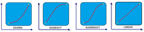
**_animCurve_**
Optional. The parameter specifies the animation curve to be applied while playing the animation. An animation curve defines the speed of the animations at different intervals of the animation duration. Following are the available options of animation curve:
* constants.ANIMATION\_CURVE\_EASEIN: Specifies the animation effect to start slow in the beginning.
* constants.ANIMATION\_CURVE\_EASEOUT: Specifies the animation effect to slowdown towards the end.
* constants.ANIMATION\_CURVE\_EASEINOUT: Specifies the animation effect to start slow and slowdown towards the end.
* constants.ANIMATION\_CURVE\_LINEAR: This is the default value. Specifies the animation effect to continue with the same speed from start to end.
animCallBacks - Optional
It is a JS dictionary containing the events invoked by the platform during the animation life cycle. Following are the available events:
* **animStarted**: Invoked at the beginning of the animation without any parameters. Following is the Syntax of the event: function animStarted()
* **animEnded**: Invoked at the end of the animation without any parameters. Following is the Syntax of the event: function animEnded()
### Return Values
None
### Exceptions
Error
### Remarks
This method is not applicable on Form, Popup, and Alert. It is also not applicable if the widget is placed in a [Segment](Segment.md). When the widget is placed in a Segment, the default _Visibility_ is set to _true_. If you want to change the value to _false_, you can do so by using [Segment](Segment_Methods.md#segmentedui-methods) methods.
Passing an invalid type other than the above events lead to run time exceptions/ crashes.
This method is not supported on the widgets FlexForm, FlexContainer, and FlexScrollContainer.
### Example
//This is a generic method that is applicable for various widgets. //Here, we have shown how to invoke the setVisibility Method for a button widget with animation. //You need to make a corresponding call of the setVisibility method for other applicable widgets.
form1.myButton.setVisibility( false, { "animEffect": constants.ANIMATION_EFFECT_COLLAPSE, "animDuration": 1, "animDelay": 0, "animCurve": constants.ANIMATION_CURVE_LINEAR, "animCallBacks": { "animStarted": startCallBackFunc, "animEnded": endCallBackFunc } }); //Sample code to invoke setVisibility Method for button widget without animation. form1.myButton.setVisibility(false);
### Platform Availability

Available on all platforms.

* * *

</details>
<details close markdown="block"><summary>unregisterForPeekandPop Method</summary>

This method unregisters a widget from 3D Touch peek and pop gestures.

### Syntax
unregisterForPeekandPop()
### Parameters

None.

### Return Values

None.

### Example
Form1.unregisterForPeekAndPop();
### Platform Availability

*   iOS 9.0 and later

</details>
<details close markdown="block"><summary>widgets Method</summary>

* * *

This method returns an array of the widget references which are direct children of Form.

### Syntax
widgets()
### Parameters

None

### Return Values

This method returns _Read only_ array of widget references. Modifying the array and changing the position of widgets in this array doesn't reflect in the Form hierarchy, however you can get handle to the widgets through this array and modify the widgets through widget level methods as exposed by individual widgets.

### Exceptions

WidgetError

### Example
//Sample code to read the direct child widgets of a FlexForm.
var myWidgets=myForm.widgets();
voltmx.print("The child widgets inside myForm FlexForm are:"+myWidgets);
```
Platform Availability
- iOS, Android, Desktop Web, SPA, and Windows