Overview
Volt MX Application Design and Development Guidelines: Application Design Guidelines > List of UI elements
User Interface (UI) Guidelines
User Interface and User Experience are critical components of mobile application development. A good user interface design must make the user choices easy and intuitive without compromising on the performance. All major platforms provide specific guidelines to make the application look and feel appealing to the user.
When we are developing applications using a cross-platform tool like Volt MX Iris we need to perform a balancing act between design and performance. Also, the application must provide native flavor on every platform. The customer also may provide UI guidelines / Style guidelines to be followed on each platform.
The guidelines outlined in this document are targeted to achieve an optimum user interface across platforms and consistency within the application. We have listed the most commonly used UI components and defined for each component the guidelines to be followed for an application to achieve the native look and feel on respective platforms.
List of UI Components
At a high-level, the following UI components are present in every application:
- Application Icon.
- Splash Screen.
- Menu.
- Fonts.
- Title bar / Navigation Controls.
- Progress indicator / Blocking UI / Interstitial screens.
- Pop-ups.
- Alignments (Margins & Paddings).
- Resources (Images).
- Container widgets, Basic widgets, and Advanced widgets. Few of the advanced widgets are:
- Segment Widget .
- Map (Map Widget).
- Browser (Browser Widget).
Guidelines for Application Icons
Following are the guidelines for creating an application icon:
- Home (Application) icon at the phone operating system should not be blurred.
- Home (Application) icon should not be a default phone OS icon. Should be an application specific icon provided by client.
- Home (Application) icon should be of the same size when compared to default phone applications icons.
Guidelines for Configuring Application Icon for iOS Applications
For more information, see
https://developer.apple.com/ios/human-interface-guidelines/graphics/app-icon/
| Icon | Idiom | Size | Image Name |
|---|---|---|---|
| App icon (required) | iPhone / iPod | 57 x 57 pixels | Icon.png |
| ^^ | ^^ | 114 x 114 pixels (@2x) | Icon@2x.png |
| App icon (required) | iPad | 72 x 72 pixels | Icon-72.png |
| ^^ | ^^ | 144 x 144 pixels (@2x) | Icon-72@2x.png |
| App icon for the App Store (required) | iPhone /iPod /iPad | 512 x 512 | iTunesArtwork |
| ^^ | ^^ | 1024 x 1024 (@2x) | iTunesArtwork@2x |
Important: iTunesArtwork icon images should be in PNG format. Name the images without the .png extension after importing them into the Xcode project. For more information, see https://developer.apple.com/library/content/qa/qa1686/_index.html
Guidelines for Configuring Application Icon for Android Applications
For more information, see
http://developer.android.com/guide/practices/ui_guidelines/icon_design_launcher_archive.html
| Icon | ldpi(120 dpi) | mdpi (160 dpi) | hdpi (240 dpi) | xhdpi (320 dpi) | xxhdpi(480 dpi) | xxxhdpi(640 dpi) |
|---|---|---|---|---|---|---|
| App Icon Size | 36 x 36 pixels | 48 x 48 pixels | 72 x 72 pixels | 96 x 96 pixels | 144 x 144 pixels | 192 x 192 pixels |
Guidelines for Configuring Application Icon for Windows Applications
Following are the application icon resolutions to be used in Windows apps:
- Application Icon should be 62 x 62 pixels.
- Startup pin images should be 173 x 173 pixels.
Configure an Application Icon from Volt MX Iris
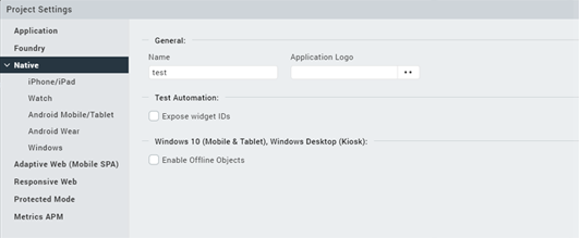
General Guidelines
Following are the General guidelines:
- Use native widget paradigms for Navigation, Application Menu, and Group Widgets. Generally overriding these native behaviors are not advisable unless there is a very good reason. For example, iPhone applications typically have a back button on the top left hand corner while Android and BlackBerry applications use the device back key to achieve the same behavior. We recommend using the default behavior instead of providing a back key on the top left hand corner for Android and BlackBerry. In this specific scenario, in case the UI designer mandates the use of back button for both Android and BlackBerry, the developer should still implement the platform specific behavior for the back key (if required, override the
onDevicebackoronEscapeform level events). - Consider internationalization while designing the application even though it may not be required in the current application version. This will ensure that the application design is future proof.
- Avoid hard-coding user displayable content, instead use i18n keys to externalize this content. In case the application supports only English, use en_US as the default locale and define i18n keys for this locale.
- Follow proper naming convention for the widgets and images in the application. For more information, see VoltMX IrisUser Guide. Do not name the widgets with keyword or namespaces used by Volt MX APIs.
-
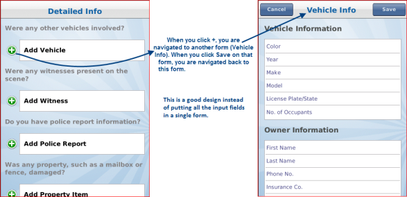
Avoid forms where the virtual height of the form is twice the height of the screen. Exception to this guideline is a Segmented UI as a screen level widget. In case, the form has more number of input fields, we recommend breaking the form into sections. Tapping on each section should lead to a new form. See the screen below for reference.
-
Setting the screen level property to True also avoids the double scrolling problem in iPhone.
- Use the Container widgets only when required. For example, placing a single label in the HBox or the VBox is not an optimal usage of the boxes.
-
To set margins or paddings to zero, provide explicit values in the margins or paddings screen.
-
Use padding for the parent widget when aligning widgets within a container. This eliminates setting margins for individual widgets in the container.
- Set margins for the containers first and then for the child widgets within.
- Use either top margins or bottom margins for creating space between components but not both when it can be achieved with only one of these two.
- Keep the data packet size between the device and the Volt MX Foundry as low as possible. This can be achieved by retrieving only those elements from the server that need to be displayed to the user or which drive the user navigation (UI Logic). In general, the elements which are never utilized on the client side, should be marked with Session scope in service request/response.
- Do not create too many skins. Use the existing skins as much as possible.
- Use skins with gradients (vertical and split) instead of images to achieve the same look and feel. If you use images, you must provide images for different form factors. Usage of images increases the size of the binary file.
- Remove all unused images and skins from the project, as it increases the binary size.
- Make sure you set the field-type for all user input fields. For example, the field-type (keyboard type) should be numeric if you have a field that expects the ZIP code to be entered.
- Ensure you have enough space (margins and paddings) between widgets when developing applications for touch devices. If you have too many widgets, it becomes difficult for the user to make selections, leading to a bad user experience.
- Use images that are big enough for clickable widgets. This enables you to easily click on touch phones.
- Avoid setting paddings for buttons with an image background. And set hexpand and vexpand to false.
- Use similar fonts, display, and focus patterns throughout the application for a uniform look and feel. Use themes wherever possible.
- Use font sizes that are large enough for the user to read.
- Make sure that the headers and footers do not exceed 30 percent of the screen height. This ensures that there is enough area for scrollable content in the page. If you severely restrict the data area for the form, the user will have to scroll a lot more to see the content.
- Avoid including text in images for the following reasons:
- Supporting internationalized content would require multiple skins.
- It increases application size.
- It creates maintenance issues if the application supports internationalized content.
- Be aware that margins and paddings are % properties (dependent on the available width of the container individual platforms except iPhone).
- Follow a standard margins/paddings pattern for consistent representation within the application. For example, use 10 px (and 2%) for all left and right margins and 5px (1%) for all the top and bottom margins.
- Use progress indicators (window.showloadingscreen for Native Applications and BlockedUI for Mobile Web) to indicate the user that a long activity is running and is in progress. For example, fetching data from a network call or rendering data on a Segmented UI. If you do not use the progress indicators, it may lead to a bad user experience as the user may try to access other widgets or perform other actions on a form.
- Use the pngout/pngcrusher or other similar tools, to shrink the images for optimizing the memory size consumed by the image.
- Use keyboard codes instead of images to support internationalization of special characters. For example, use numock+Alt+0169 for the copyright symbol (©).
- For TextBoxes, use placeholder property appropriately.
- For lines, create a Label with 1 dp height.
Browser
Following are the Browser Widget guidelines:
- Use RichText widget only when there is a need to display text with different fonts or HTML tags (for example, bold, italics, and so on). Use this widget only for small content (2-3 lines of text). If the content is large, use a Browser widget instead.
- Do not use more than two Browser widgets in an application as a Browser widget is heavy in terms of memory (especially on Android platform).
- Avoid placing other widgets on the forms that have either browser or Map widget as they are more optimized if they are screen level widgets. If absolutely essential, for such forms create a custom header and footer, in which other widgets can be placed (below or above the Map or Browser widgets). This is an important aspect to be considered for non-touch devices.
- When you set the ScreenLevel widget Platform Specific Property (PSP) to true for a Browser, make sure that other widgets like Map or Segment have this property set to false. If multiple widgets have this property set to true, the information in these widgets may not display with appropriate scrolling behavior.
Map
Following are the Map Widget guidelines:
- Avoid using multiple Map widgets in an application. Use a single Map widget and write the code in such a way that data is redirected to the same widget.
- Ensure that the Google Map Widget or any other such external interface has its branding associated with it. If you do not do this, the application may be rejected when submitted for certification.
- When you set the ScreenLevel widget PSP to true for a Map, make sure that other widgets like Segment or Browser have this property set to false. If multiple widgets have this property set to true, the information in these widgets may not display with appropriate scrolling behavior.
- For development convenience, ensure that all developers in the project use the same
Android debug keyandAndroid Map key.
Segmented UI
Following are the Segmented UI guidelines:
- Use the orientation property for a Segmented UI to align the child widgets horizontally or vertically instead of using an HBox or VBox to achieve the same.
- Avoid complex view hierarchy while designing Segmented UI. A view hierarchy is defined as the arrangement of boxes and widgets within them. Nesting of boxes in multiples of 4-5 and having 10-15 widgets in each of these boxes can lead to memory and performance issues.
- For a simple segment design, the number of rows in a segment can be as high as 100, while for complex segment design, it can be as low as 20.
- Use pagination if there are more than 15-20 recordsThe number 15-20 has been arrived at by looking at popular applications and taking into account the user experience. to be displayed in a Segmented UI.
- In case, the Segment has more than 15-20 records or has a complex view hierarchy, setting the ScreenLevel widget PSP to true for iPhone and Android leads to better scrolling performance. This is due to the fact that with this property set to true, the Segmented UI widget re-uses the boxes as the user scrolls. The downfall of this property is that the Segmented UI is the only scrollable widget on the form. The other widgets should be the part of header or footer.
- When you set the ScreenLevel widget PSP to true for a Segment, make sure that other widgets like Map or Browser have this property set to false. If multiple widgets have this property set to true, the information in these widgets may not display with appropriate scrolling behavior.
-
Invoke the
segui.setdatamethod when the data is ready and never call it repeatedly/unnecessarily in loops.Example of bad code:
local segdata = {}
for i,v in ipairs(somedataset)
...segdata[i] = v;
...segui.setdata(formid.seguid,segdata);
end
Example of good code:
local segdata = {}
for i,v in ipairs(somedataset)
...segdata[i] = v;
end
segui.setdata(formid.seguid,segdata);
-
Use the widgetdatamap property for Segmented UI to define the structure of the data and then invoke the setdata method.
- Make sure that all the required widgets are added in the widgetdatamap property.
- Do not create excessive labels in a Segment for mapping hidden fields. Use the Hidden Columns property to set hidden fields.
-
For good scrolling behavior on non-touch devices, avoid SegmentedUI design that results in a focusable segment whose height is more than the available displayable height.
Note: Here the segment height is the height of the individual segment and not the combined height of all the segments in a SegmentedUI.