SlidingContainer Properties
A SlidingContainer Widget has the following properties.
bottom Property
This property determines the bottom edge of the widget and is measured from the bottom bounds of the parent container.
The bottom property determines the position of the bottom edge of the widget’s bounding box. The value may be set using DP (Device Independent Pixels), Percentage, or Pixels. In freeform layout, the distance is measured from the bottom edge of the parent container. In flow-vertical layout, the value is ignored. In flow-horizontal layout, the value is ignored.
The bottom property is used only if the Height property is not provided.
Syntax
bottom
Type
String
Read/Write
Read + Write
Remarks
The property determines the bottom edge of the widget and is measured from the bottom bounds of the parent container.
If the layoutType is set as voltmx.flex.FLOW_VERTICAL, the bottom property is measured from the top edge of bottom sibling widget. The vertical space between two widgets is measured from bottom of the top sibling widget and the top of the bottom sibling widget.
Example
//Sample code to set the bottom property for widgets by using DP, Percentage and Pixels.
frmHome.widgetID.bottom = "50dp";

frmHome.widgetID.bottom = "10%";

frmHome.widgetID.bottom = "10px";
Platform Availability
- Available in the IDE
- iOS, Android, Windows, SPA , and Desktop Web
cacheMode
The property enables or disables the cache underlying the OS UI element when the contentPanel content is changed.
Syntax
cacheMode
Type
Boolean
Read/Write
Read only. The property is a constructor value and cannot be modified dynamically.
Remarks
If the value is true, the cache is enabled. The default value is false.
Example
frmHome.slidingContainer.cacheMode = true;
Platform Availability
Windows
centerX Property
This property determines the center of a widget measured from the left bounds of the parent container.
The centerX property determines the horizontal center of the widget’s bounding box. The value may be set using DP (Device Independent Pixels), Percentage, or Pixels. In freeform layout, the distance is measured from the left edge of the parent container. In flow-vertical layout, the distance is measured from the left edge of the parent container. In flow-horizontal layout, the distance is measured from the right edge of the previous sibling widget in the hierarchy.
Syntax
centerX
Type
String
Read/Write
Read + Write
Remarks
If the layoutType is set as voltmx.flex.FLOW_HORIZONTAL, the centerX property is measured from right edge of the left sibling widget.
Example
//Sample code to set the centerX property for widgets by using DP, Percentage and Pixels.
frmHome.widgetID.centerX = "50dp";

frmHome.widgetID.centerX = "10%";

frmHome.widgetID.centerX = "10px";
Platform Availability
- Available in the IDE
- iOS, Android, Windows, SPA, and Desktop Web
centerY Property
This property determines the center of a widget measured from the top bounds of the parent container.
The centerY property determines the vertical center of the widget’s bounding box. The value may be set using DP (Device Independent Pixels), Percentage, or Pixels. In freeform layout, the distance is measured from the top edge of the parent container. In flow-horizontal layout, the distance is measured from the top edge of the parent container. In flow-vertical layout, the distance is measured from the bottom edge of the previous sibling widget in the hierarchy.
Syntax
centerY
Type
String
Read/Write
Read + Write
Remarks
If the layoutType is set as voltmx.flex.FLOW_VERTICAL, the centerY property is measured from bottom edge of the top sibling widget.
Example
//Sample code to set the centerY property for widgets by using DP, Percentage and Pixels.
frmHome.widgetID.centerY = "50dp";

frmHome.widgetID.centerY = "10%";

frmHome.widgetID.centerY = "10px";
Platform Availability
- Available in the IDE
- iOS, Android, Windows, SPA, and Desktop Web
commandPanel Property
The property specifies the commandPanel of the SlidingContainer widget. This property gets or sets the box or flex container that controls the navigation in the contentPanel.
Syntax
commandPanel
Type
Container widget object
Read/Write
Read + Write.
Example
//Sample code to set the commandPanel property of a SlidingContainer widget.
frmSlidingC.mySlidingC.commandPanel = getCommandPanel();

function getCommandPanel() {
 var flexCommandBar = new voltmx.ui.FlexScrollContainer({
  "allowHorizontalBounce": false,
  "allowVerticalBounce": true,
  "bounces": true,
  "clipBounds": true,
  "enableScrolling": true,
  "height": "100%",
  "horizontalScrollIndicator": true,
  "id": "flexCommandBar",
  "isVisible": true,
  "layoutType": voltmx.flex.FLOW_VERTICAL,
  "left": "0dp",
  "pagingEnabled": false,
  "scrollDirection": voltmx.flex.SCROLL_VERTICAL,
  "skin": "slFSbox",
  "top": "0dp",
  "verticalScrollIndicator": true,
  "width": "100%",
  "zIndex": 1
 }, {}, {});
 flexCommandBar.setDefaultUnit(voltmx.flex.DP);
 var Segment02c7ccb3119b647 = new voltmx.ui.SegmentedUI2({
  "autogrowMode": voltmx.flex.AUTOGROW_NONE,
  "data": [{
   "Image085cea286b0f547": "imagedrag.png",
   "Label0cf1dbb34901648": "Home"
  }, {
   "Image085cea286b0f547": "imagedrag.png",
   "Label0cf1dbb34901648": "About Us"
  }, {
   "Image085cea286b0f547": "imagedrag.png",
   "Label0cf1dbb34901648": "Services"
  }, {
   "Image085cea286b0f547": "imagedrag.png",
   "Label0cf1dbb34901648": "Products"
  }],
  "groupCells": false,
  "height": "100%",
  "id": "Segment02c7ccb3119b647",
  "isVisible": true,
  "left": "0dp",
  "needPageIndicator": true,
  "pageOffDotImage": "pageoffdot.png",
  "pageOnDotImage": "pageondot.png",
  "retainSelection": false,
  "rowFocusSkin": "Copyseg0fcdea63e62b44a",
  "rowSkin": "seg2Normal",
  "rowTemplate": FlexContainer0b64a0fc1327444,
  "scrollingEvents": {},
  "sectionHeaderSkin": "sliPhoneSegmentHeader",
  "selectionBehavior": constants.SEGUI_DEFAULT_BEHAVIOR,
  "separatorColor": "64646400",
  "separatorRequired": true,
  "separatorThickness": 1,
  "showScrollbars": false,
  "top": "0dp",
  "viewType": constants.SEGUI_VIEW_TYPE_TABLEVIEW,
  "widgetDataMap": {
   "FlexContainer0b64a0fc1327444": "FlexContainer0b64a0fc1327444",
   "Image085cea286b0f547": "Image085cea286b0f547",
   "Label0cf1dbb34901648": "Label0cf1dbb34901648"
  },
  "width": "150dp",
  "zIndex": 1
 }, {
  "padding": [0, 0, 0, 0],
  "paddingInPixel": false
 }, {});
 Segment02c7ccb3119b647.onRowClick = function(args) {
frmSlidingC.mySlidingC.contentPanel = getContentPanel("Selected Item:"+ args.selectedRowIndex);
 };
 flexCommandBar.add(Segment02c7ccb3119b647);
 return flexCommandBar;
}
Platform Availability
Windows
commandPanelCompactWidth
The property specifies the size of the commandPanel when it is closed and the display mode is compact type.
Syntax
commandPanelCompactWidth
Type
Double
Read/Write
Read only. The property is a constructor value and cannot be modified dynamically.
Example
function getSlidingContainerWidget() {
    var basic = {
        "height": "100%",
        "id": "slidingContainer",
        "isVisible": true,
        "left": "0dp",
        "top": "0dp",
        "width": "100%",
        "zIndex": 1,
        "commandPanel": getCommandPanel(),
        "contentPanel": getContentPanel("Welcome to Sliding Container!!!"),
        **"commandPanelCompactWidth": "100dp"**,
        "commandPanelExpandedWidth": "120dp",
        "commandPanelPosition": "0",
        "menuDisplayMode": 2,
        "showMenu": true
    };
    var advanced = {};
    var psps = {};
    slidingContainer = new voltmx.ui.SlidingContainer(basic, advanced, psps);
    return slidingContainer;
}
Platform Availability
Windows
commandPanelExpandedWidth
The property specifies the size of the commandPanel when it is open.
Syntax
commandPanelExpandedWidth
Type
Double
Read/Write
Read only. The property is a constructor value and cannot be modified dynamically.
Example
function getSlidingContainerWidget() {
    var basic = {
        "height": "100%",
        "id": "slidingContainer",
        "isVisible": true,
        "left": "0dp",
        "top": "0dp",
        "width": "100%",
        "zIndex": 1,
        "commandPanel": getCommandPanel(),
        "contentPanel": getContentPanel("Welcome to Sliding Container!!!"),
        "commandPanelCompactWidth": "100dp",
        **"commandPanelExpandedWidth": "120dp"**,
        "commandPanelPosition": "0",
        "menuDisplayMode": 2,
        "showMenu": true
    };
    var advanced = {};
    var psps = {};
    slidingContainer = new voltmx.ui.SlidingContainer(basic, advanced, psps);
    return slidingContainer;
}
Platform Availability
Windows
commandPanelPosition Property
The property gets or sets the command panel position.
Syntax
commandPanelPosition
Type
Integer
Read/Write
Read only. The property is a constructor value and cannot be modified dynamically.
Remarks
The possible values are:
- SLIDING_CONTAINER_COMMandPANELPOSITION_LEFT = 0
- SLIDING_CONTAINER_COMMandPANELPOSITION_RIGHT = 1
The default value is SLIDING_CONTAINER_COMMandPANELPOSITION_LEFT.
Example
function getSlidingContainerWidget() {
    var basic = {
        "height": "100%",
        "id": "slidingContainer",
        "isVisible": true,
        "left": "0dp",
        "top": "0dp",
        "width": "100%",
        "zIndex": 1,
        "commandPanel": getCommandPanel(),
        "contentPanel": getContentPanel("Welcome to Sliding Container!!!"),
        "commandPanelCompactWidth": "100dp",
        "commandPanelExpandedWidth": "120dp",
        **"commandPanelPosition": "0"**,
        "menuDisplayMode": 2,
        "showMenu": true
    };
    var advanced = {};
    var psps = {};
    slidingContainer = new voltmx.ui.SlidingContainer(basic, advanced, psps);
    return slidingContainer;
}
Platform Availability
Windows
commandPanelSkin Property
The property specifies the skin for the commandPanel of the SlidingContainer Widget.
Syntax
commandPanelSkin
Type
Text
Read/Write
Read + Write.
Example
frmHome.slidingContainer.commandPanelSkin = "SlidingContainerSkin";
Platform Availability
Windows
contentPanel Property
The property specifies the contentPanel of the SlidingContainer widget. The property gets or sets a box or flex container that has complex content.
Syntax
contentPanel
Type
Container widget object
Read/Write
Read + Write.
Example
//Sample code to set the contentPanel property of a SlidingContainer widget.
frmSlidingC.mySlidingC.contentPanel=getContentPanel("Welcome to Sliding Container!!!");

function getContentPanel(data) {

 var FlexScrollContainer01b86102e632046 = new voltmx.ui.FlexScrollContainer({
  "allowHorizontalBounce": false,
  "allowVerticalBounce": true,
  "bounces": true,
  "clipBounds": true,
  "enableScrolling": true,
  "height": "100%",
  "horizontalScrollIndicator": true,
  "id": "FlexScrollContainer01b86102e632046",
  "isVisible": true,
  "layoutType": voltmx.flex.FREE_FORM,
  "left": "0dp",
  "pagingEnabled": false,
  "scrollDirection": voltmx.flex.SCROLL_VERTICAL,
  "skin": "slFSbox",
  "top": "0dp",
  "verticalScrollIndicator": true,
  "width": "100%",
  "zIndex": 1
 }, {}, {});
 FlexScrollContainer01b86102e632046.setDefaultUnit(voltmx.flex.DP);
 var Label08300df04e5394e = new voltmx.ui.Label({
  "id": "Label08300df04e5394e",
  "isVisible": true,
  "left": "0dp",
  "skin": "slLabel",
  "text": "" + data,
  "top": "0dp",
  "width": voltmx.flex.USE_PREFFERED_SIZE,
  "zIndex": 1
 }, {
  "contentAlignment": constants.CONTENT_ALIGN_MIDDLE_LEFT,
  "padding": [0, 0, 0, 0],
  "paddingInPixel": false
 }, {});
 FlexScrollContainer01b86102e632046.add(Label08300df04e5394e);
 return FlexScrollContainer01b86102e632046;
}
Platform Availability
Windows
height Property
It determines the height of the widget and measured along the y-axis.
The height property determines the height of the widget’s bounding box. The value may be set using DP (Device Independent Pixels), Percentage, or Pixels. For supported widgets, the height may be derived from either the widget or container’s contents by setting the height to “preferred”.
Syntax
height
Type
Number, String, and Constant
Read/Write
Read + Write
Remarks
Following are the available measurement options:
- %: Specifies the values in percentage relative to the parent dimensions.
- px: Specifies the values in terms of device hardware pixels.
- dp: Specifies the values in terms of device independent pixels.
- default: Specifies the default value of the widget.
- voltmx.flex.USE_PREFERED_SIZE: When this option is specified, the layout uses preferred height of the widget as height and preferred size of the widget is determined by the widget and may varies between platforms.
Example
/*Sample code to set the height property for a SlidingContainer widget by using DP, Percentage and Pixels.*/
frmSlidingC.mySlidingC.height="50dp";

frmSlidingC.mySlidingC.height="10%";

frmSlidingC.mySlidingC.height="10px";
Platform Availability
- Windows10
left Property
This property determines the lower left corner edge of the widget and is measured from the left bounds of the parent container.
The left property determines the position of the left edge of the widget’s bounding box. The value may be set using DP (Device Independent Pixels), Percentage, or Pixels. In freeform layout, the distance is measured from the left edge of the parent container. In flow-vertical layout, the distance is measured from the left edge of the parent container. In flow-horizontal layout, the distance is measured from the right edge of the previous sibling widget in the hierarchy.
Syntax
left
Type
String
Read/Write
Read + Write
Remarks
If the layoutType is set as voltmx.flex.FLOW_HORIZONTAL, the left property is measured from right edge of the left sibling widget.
Example
//Sample code to set the left property for widgets by using DP, Percentage and Pixels.
frmHome.widgetID.left = "50dp";

frmHome.widgetID.left = "10%";

frmHome.widgetID.left = "10px";
Platform Availability
- Available in the IDE
- iOS, Android, Windows, SPA, and Desktop Web
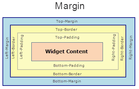
margin Property
This property specifies the space around a widget. You can use this option to define the left, top, right, and bottom distance between the widget and the next element.
Syntax
margin
Type
Array of numbers
Read/Write
Read + Write
Remarks
The property is applicable only if the widget is in a flex container.
To define the margin values for a platform, click the Click to Edit button against the property to open the Margin screen. Select the checkbox of the platform for which you want to define the margins, and enter the top, left, right, and bottom margin values.
If you want to use the margin values across other platforms, you can click the Apply To button and select the platforms on which you want the margin values to be applied.
The following image illustrates a widget with a defined margin:
Platform Availability
Windows
marginInPixel Property
The property specifies whether the margin is applied in percentage or in pixels.
Syntax
marginInPixel
Type
Boolean
Read/Write
Read + Write
Remarks
If the value is true, the margins are applied in pixels. If the value is false, the margins are applied as in the margin property. The default value is _false_The property is applicable only if the widget is in a flex container.
Platform Availability
Windows
maxHeight Property
This property specifies the maximum height of the widget and is applicable only when the height property is not specified.
The maxHeight property determines the maximum height of the widget’s bounding box. The value may be set using DP (Device Independent Pixels), Percentage, or Pixels. The maxHeight value overrides the preferred, or “autogrow” height, if the maxHeight is less than the derived content height of the widget.
Syntax
maxHeight
Type
Number
Read/Write
Read + Write
Example
//Sample code to set the maxHeight property for widgets by using DP, Percentage and Pixels.
frmHome.widgetID.maxHeight = "50dp";

frmHome.widgetID.maxHeight = "10%";

frmHome.widgetID.maxHeight = "10px";
Platform Availability
- Available in the IDE
- iOS, Android, Windows, SPA, and Desktop Web
maxWidth Property
This property specifies the maximum width of the widget and is applicable only when the width property is not specified.
The Width property determines the maximum width of the widget’s bounding box. The value may be set using DP (Device Independent Pixels), Percentage, or Pixels. The maxWidth value overrides the preferred, or “autogrow” width, if the maxWidth is less than the derived content width of the widget.
Syntax
maxWidth
Type
Number
Read/Write
Read + Write
Example
//Sample code to set the maxWidth property for widgets by using DP, Percentage and Pixels.
frmHome.widgetID.maxWidth = "50dp";

frmHome.widgetID.maxWidth = "10%";

frmHome.widgetID.maxWidth = "10px";
Platform Availability
- Available in the IDE
- iOS, Android, Windows, SPA, and Desktop Web
menuDisplayMode Property
The property gets or sets the display mode of the menu.
Syntax
menuDisplayMode
Type
Integer
Read/Write
Read only. The property is a constructor value and cannot be modified dynamically.
Remarks
The possible values for the property are:
- SLIDING_CONTAINER_DisplayMode_Overlay = 0;
- SLIDING_CONTAINER_DisplayMode_Inline = 1;
- SLIDING_CONTAINER_DisplayMode_CompactOverlay = 2;
- SLIDING_CONTAINER_DisplayMode_CompactInline = 3;
The default menu display mode is SLIDING_CONTAINER_DisplayMode_CompactOverlay.
Example
function getSlidingContainerWidget() {
    var basic = {
        "height": "100%",
        "id": "slidingContainer",
        "isVisible": true,
        "left": "0dp",
        "top": "0dp",
        "width": "100%",
        "zIndex": 1,
        "commandPanel": getCommandPanel(),
        "contentPanel": getContentPanel("Welcome to Sliding Container!!!"),
        "commandPanelCompactWidth": "100dp",
        "commandPanelExpandedWidth": "120dp",
        "commandPanelPosition": "0",
        **"menuDisplayMode": 2**,
        "showMenu": true
    };
    var advanced = {};
    var psps = {};
    slidingContainer = new voltmx.ui.SlidingContainer(basic, advanced, psps);
    return slidingContainer;
}
Platform Availability
Windows
menuIconSkin Property
The property specifies the font skins of the menuIcon. This property creates symbols by setting the text of the menuText property.
Syntax
menuIconSkin
Type
String
Read/Write
Read + Write.
Example
frmHome.slidingContainer.menuIconSkin = "MenuIconSkin";
Platform Availability
Windows
menuSkin Property
This property specifies the skin of the menu bar for the default hamburger menu.
Syntax
menuSkin
Type
String
Read/Write
Read + Write.
Example
frmHome.slidingContainer.menuSkin = "MenuSkin";
Platform Availability
Windows
menuText Property
The property gets or sets the default menu icon text.
Syntax
menuText
Type
String
Read/Write
Read + Write.
Example
frmHome.slidingContainer.menuText = "Its the Menu Text";
Platform Availability
Windows
minHeight Property
This property specifies the minimum height of the widget and is applicable only when the height property is not specified.
The minHeight property determines the minimum height of the widget’s bounding box. The value may be set using DP (Device Independent Pixels), Percentage, or Pixels. The minHeight value overrides the preferred, or “autogrow” height, if the minHeight is larger than the derived content height of the widget.
Syntax
minHeight
Type
Number
Read/Write
Read + Write
Example
//Sample code to set the minHeight property for widgets by using DP, Percentage and Pixels.
frmHome.widgetID.minHeight = "50dp";

frmHome.widgetID.minHeight = "10%";

frmHome.widgetID.minHeight = "10px";
Platform Availability
- Available in the IDE
- iOS, Android, Windows, SPA, and Desktop Web
minWidth Property
This property specifies the minimum width of the widget and is applicable only when the width property is not specified.
The minWidth property determines the minimum width of the widget’s bounding box. The value may be set using DP (Device Independent Pixels), Percentage, or Pixels. The minWidth value overrides the preferred, or “autogrow” width, if the minWidth is larger than the derived content width of the widget.
Syntax
minWidth
Type
Number
Read/Write
Read only
Example
//Sample code to set the minWidth property for widgets by using DP, Percentage and Pixels.
frmHome.widgetID.minWidth = "50dp";

frmHome.widgetID.minWidth = "10%";

frmHome.widgetID.minWidth = "10px";
Platform Availability
- Available in the IDE
- iOS, Android, Windows, SPA, and Desktop Web
openCommandPanel Property
The property opens or closes the command panel.
Syntax
openCommandPanel
Type
Boolean
Read/Write
Read + Write.
Example
frmHome.slidingContainer.openCommandPanel = true;
Platform Availability
Windows
retainContentAlignment Property
This property is used to retain the content alignment property value, as it was defined.
Note: Locale-level configurations take priority when invalid values are given to this property, or if it is not defined.
The mirroring widget layout properties should be defined as follows.
function getIsFlexPositionalShouldMirror(widgetRetainFlexPositionPropertiesValue) {
    return (isI18nLayoutConfigEnabled &&
    localeLayoutConfig[defaultLocale]
    ["mirrorFlexPositionalProperties"] == true &&
    !widgetRetainFlexPositionPropertiesValue);
}
The following table illustrates how widgets consider Local flag and Widget flag values.
| Properties | Local Flag Value | Widget Flag Value | Action |
|---|---|---|---|
| Mirror/retain FlexPositionProperties | true | true | Use the designed layout from widget for all locales. Widget layout overrides everything else. |
| Mirror/retain FlexPositionProperties | true | false | Use Mirror FlexPositionProperties since locale-level Mirror is true. |
| Mirror/retain FlexPositionProperties | true | not specified | Use Mirror FlexPositionProperties since locale-level Mirror is true. |
| Mirror/retain FlexPositionProperties | false | true | Use the designed layout from widget for all locales. Widget layout overrides everything else. |
| Mirror/retain FlexPositionProperties | false | false | Use the Design/Model-specific default layout. |
| Mirror/retain FlexPositionProperties | false | not specified | Use the Design/Model-specific default layout. |
| Mirror/retain FlexPositionProperties | not specified | true | Use the designed layout from widget for all locales. Widget layout overrides everything else. |
| Mirror/retain FlexPositionProperties | not specified | false | Use the Design/Model-specific default layout. |
| Mirror/retain FlexPositionProperties | not specified | not specified | Use the Design/Model-specific default layout. |
Syntax
retainContentAlignment
Type
Boolean
Read/Write
No (only during widget-construction time)
Example
//This is a generic property that is applicable for various widgets.
//Here, we have shown how to use the retainContentAlignment property for Button widget.
/*You need to make a corresponding use of the
retainContentAlignment property for other applicable widgets.*/
var btn = new voltmx.ui.Button({
    "focusSkin": "defBtnFocus",
    "height": "50dp",
    "id": "myButton",
    "isVisible": true,
    "left": "0dp",
    "skin": "defBtnNormal",
    "text": "text always from top left",
    "top": "0dp",
    "width": "260dp",
    "zIndex": 1
}, {
    "contentAlignment": constants.CONTENT_ALIGN_TOP_LEFT,
    "displayText": true,
    "padding": [0, 0, 0, 0],
    "paddingInPixel": false,
    "retainFlexPositionProperties": false,
    "retainContentAlignment": true
}, {});
Platform Availability
- Available in IDE
- Windows, iOS, Android, and SPA
retainFlexPositionProperties Property
This property is used to retain flex positional property values as they were defined. The flex positional properties are left, right, and padding.
Note: Locale-level configurations take priority when invalid values are given to this property, or if it is not defined.
The mirroring widget layout properties should be defined as follows.
function getIsFlexPositionalShouldMirror(widgetRetainFlexPositionPropertiesValue) {
    return (isI18nLayoutConfigEnabled &&
    localeLayoutConfig[defaultLocale]
    ["mirrorFlexPositionalProperties"] == true &&
    !widgetRetainFlexPositionPropertiesValue);
}
The following table illustrates how widgets consider Local flag and Widget flag values.
| Properties | Local Flag Value | Widget Flag Value | Action |
|---|---|---|---|
| Mirror/retain FlexPositionProperties | true | true | Use the designed layout from widget for all locales. Widget layout overrides everything else. |
| Mirror/retain FlexPositionProperties | true | false | Use Mirror FlexPositionProperties since locale-level Mirror is true. |
| Mirror/retain FlexPositionProperties | true | not specified | Use Mirror FlexPositionProperties since locale-level Mirror is true. |
| Mirror/retain FlexPositionProperties | false | true | Use the designed layout from widget for all locales. Widget layout overrides everything else. |
| Mirror/retain FlexPositionProperties | false | false | Use the Design/Model-specific default layout. |
| Mirror/retain FlexPositionProperties | false | not specified | Use the Design/Model-specific default layout. |
| Mirror/retain FlexPositionProperties | not specified | true | Use the designed layout from widget for all locales. Widget layout overrides everything else. |
| Mirror/retain FlexPositionProperties | not specified | false | Use the Design/Model-specific default layout. |
| Mirror/retain FlexPositionProperties | not specified | not specified | Use the Design/Model-specific default layout. |
Syntax
retainFlexPositionProperties
Type
Boolean
Read/Write
No (only during widget-construction time)
Example
//This is a generic property that is applicable for various widgets.
//Here, we have shown how to use the retainFlexPositionProperties property for Button widget.
/*You need to make a corresponding use of the
retainFlexPositionProperties property for other applicable widgets.*/
var btn = new voltmx.ui.Button({
    "focusSkin": "defBtnFocus",
    "height": "50dp",
    "id": "myButton",
    "isVisible": true,
    "left": "0dp",
    "skin": "defBtnNormal",
    "text": "always left",
    "top": "0dp",
    "width": "260dp",
    "zIndex": 1
}, {
    "contentAlignment": constants.CONTENT_ALIGN_CENTER,
    "displayText": true,
    "padding": [0, 0, 0, 0],
    "paddingInPixel": false,
    "retainFlexPositionProperties": true,
    "retainContentAlignment": false
}, {});
Platform Availability
- Available in IDE
- Windows, iOS, Android, and SPA
retainFlowHorizontalAlignment Property
This property is used to convert Flow Horizontal Left to Flow Horizontal Right.
Note: Locale-level configurations take priority when invalid values are given to this property, or if it is not defined.
The mirroring widget layout properties should be defined as follows.
function getIsFlexPositionalShouldMirror(widgetRetainFlexPositionPropertiesValue) {
    return (isI18nLayoutConfigEnabled &&
    localeLayoutConfig[defaultLocale]
    ["mirrorFlexPositionalProperties"] == true &&
    !widgetRetainFlexPositionPropertiesValue);
}
The following table illustrates how widgets consider Local flag and Widget flag values.
| Properties | Local Flag Value | Widget Flag Value | Action |
|---|---|---|---|
| Mirror/retain FlexPositionProperties | true | true | Use the designed layout from widget for all locales. Widget layout overrides everything else. |
| Mirror/retain FlexPositionProperties | true | false | Use Mirror FlexPositionProperties since locale-level Mirror is true. |
| Mirror/retain FlexPositionProperties | true | not specified | Use Mirror FlexPositionProperties since locale-level Mirror is true. |
| Mirror/retain FlexPositionProperties | false | true | Use the designed layout from widget for all locales. Widget layout overrides everything else. |
| Mirror/retain FlexPositionProperties | false | false | Use the Design/Model-specific default layout. |
| Mirror/retain FlexPositionProperties | false | not specified | Use the Design/Model-specific default layout. |
| Mirror/retain FlexPositionProperties | not specified | true | Use the designed layout from widget for all locales. Widget layout overrides everything else. |
| Mirror/retain FlexPositionProperties | not specified | false | Use the Design/Model-specific default layout. |
| Mirror/retain FlexPositionProperties | not specified | not specified | Use the Design/Model-specific default layout. |
Syntax
retainFlowHorizontalAlignment
Type
Boolean
Read/Write
No (only during widget-construction time)
Example
//This is a generic property that is applicable for various widgets.
//Here, we have shown how to use the retainFlowHorizontalAlignment property for Button widget.
/*You need to make a corresponding use of the
retainFlowHorizontalAlignment property for other applicable widgets. */
var btn = new voltmx.ui.Button({
 "focusSkin": "defBtnFocus",
 "height": "50dp",
 "id": "myButton",
 "isVisible": true,
 "left": "0dp",
 "skin": "defBtnNormal",
 "text": "always left",
 "top": "0dp",
 "width": "260dp",
 "zIndex": 1
}, {
 "contentAlignment": constants.CONTENT_ALIGN_CENTER,
 "displayText": true,
 "padding": [0, 0, 0, 0],
 "paddingInPixel": false,
 "retainFlexPositionProperties": true,
 "retainContentAlignment": false,
 "retainFlowHorizontalAlignment ": false
}, {});
Platform Availability
- Available in IDE
- Windows, iOS, Android, and SPA
right Property
This property determines the lower right corner of the widget and is measured from the right bounds of the parent container.
The right property determines the position of the right edge of the widget’s bounding box. The value may be set using DP (Device Independent Pixels), Percentage, or Pixels. In freeform layout, the distance is measured from the left edge of the parent container. In flow-vertical layout, value is ignored. In flow-horizontal layout, the value is ignored.
The right property is used only if the width property is not provided.
Syntax
right
Type
String
Read/Write
Read + Write
Remarks
If the layoutType is set as voltmx.flex.FLOW_HORIZONTAL, the right property is measured from left edge of the right sibling widget. The horizontal space between two widgets is measured from right of the left sibling widget and left of the right sibling widget.
Example
//Sample code to set the right property for widgets by using DP, Percentage and Pixels.
frmHome.widgetID.right = "50dp";

frmHome.widgetID.right = "10%";

frmHome.widgetID.right = "10px";
Platform Availability
- Available in the IDE
- iOS, Android, Windows, SPA, and Desktop Web
showMenu Property
The property enables or disables the default hamburger menu.
Syntax
showMenu
Type
Boolean
Read/Write
Read only. The property is a constructor value and cannot be modified dynamically.
Example
function getSlidingContainerWidget() {
    var basic = {
        "height": "100%",
        "id": "slidingContainer",
        "isVisible": true,
        "left": "0dp",
        "top": "0dp",
        "width": "100%",
        "zIndex": 1,
        "commandPanel": getCommandPanel(),
        "contentPanel": getContentPanel("Welcome to Sliding Container!!!"),
        "commandPanelCompactWidth": "100dp",
        "commandPanelExpandedWidth": "120dp",
        "commandPanelPosition": "0",
        "menuDisplayMode": 2,
        **"showMenu": true**
    };
    var advanced = {};
    var psps = {};
    slidingContainer = new voltmx.ui.SlidingContainer(basic, advanced, psps);
    return slidingContainer;
}
Platform Availability
Windows
title Property
The property gets or sets the default menu title.
Syntax
title
Type
String
Read/Write
Read + Write.
Example
frmHome.slidingContainer.title = "TITLE PROPERTY";
Platform Availability
Windows
top Property
This property determines the top edge of the widget and measured from the top bounds of the parent container.
The top property determines the position of the top edge of the widget’s bounding box. The value may be set using DP (Device Independent Pixels), Percentage, or Pixels. In freeform layout, the distance is measured from the top edge of the parent container. In flow-vertical layout, the distance is measured from the bottom edge of the previous sibling widget in the hierarchy. In flow-horizontal layout, the distance is measured from the left edge of the parent container.
Syntax
top
Type
String
Read/Write
Read + Write
Remarks
If the layoutType is set as voltmx.flex.FLOW_VERTICAL, the top property is measured from the bottom edge of the top sibling widget. The vertical space between two widgets is measured from bottom of the top sibling widget and top of the bottom sibling widget.
Example
//Sample code to set the top property for widgets by using DP, Percentage and Pixels.
frmHome.widgetID.top = "50dp";

frmHome.widgetID.top = "10%";

frmHome.widgetID.top = "10px";
Platform Availability
- Available in the IDE
- iOS, Android, Windows, SPA, and Desktop Web
widgetAlignment Property
Indicates how a widget is to be anchored with respect to its parent. Each of these below options have a horizontal alignment attribute and a vertical alignment attribute. For example, WIDGET_ALIGN_TOP_LEFT specifies the vertical alignment as TOP and horizontal alignment as LEFT.
Syntax
widgetAlignment
Type
Number
Read/Write
No
Remarks
Horizontal alignment attributes are only applicable if hExpand is false. Similarly vertical alignment attributes are only applicable if vExpand is false.
Default: WIDGET_ALIGN_CENTER
The available options are:
- WIDGET_ALIGN_TOP_LEFT
- WIDGET_ALIGN_TOP_CENTER
- WIDGET_ALIGN_TOP_RIGHT
- WIDGET_ALIGN_MIDDLE_LEFT
- WIDGET_ALIGN_CENTER
- WIDGET_ALIGN_MIDDLE_RIGHT
- WIDGET_ALIGN_BOTTOM_LEFT
- WIDGET_ALIGN_BOTTOM_CENTER
- WIDGET_ALIGN_BOTTOM_RIGHT
Example
//This is a generic property that is applicable for various widgets.
//Here, we have shown how to use the widgetAlignment property for Phone widget.
/*You need to make a corresponding use of the
widgetAlignment property for other applicable widgets.*/

frmPhone.myPhone.widgetAlignment=constants.WIDGET_ALIGN_CENTER;
Platform Availability
Available in the IDE
Available on all platforms except on Desktop Web platform.
width Property
This property determines the width of the widget and is measured along the x-axis.
The width property determines the width of the widget’s bounding box. The value may be set using DP (Device Independent Pixels), Percentage, or Pixels. For supported widgets, the width may be derived from either the widget or container’s contents by setting the width to “preferred”.
Syntax
width
Type
Number, String, and Constant
Read/Write
Read + Write
Remarks
Following are the options that can be used as units of width:
- %: Specifies the values in percentage relative to the parent dimensions.
- px: Specifies the values in terms of device hardware pixels.
- dp: Specifies the values in terms of device independent pixels.
- default: Specifies the default value of the widget.
- voltmx.flex.USE_PREFERED_SIZE: When this option is specified, the layout uses preferred width of the widget as width and preferred size of the widget is determined by the widget and may varies between platforms.
Example
//Sample code to set the width property for widgets by using DP, Percentage and Pixels.
frmHome.widgetID.width = "50dp";

frmHome.widgetID.width = "10%";

frmHome.widgetID.width = "10px";
Platform Availability
- Available in the IDE
- iOS, Android, Windows, SPA, and Desktop Web
zIndex Property
This property specifies the stack order of a widget. A widget with a higher zIndex is always in front of a widget with a lower zIndex.
The zIndex property is used to set the stack, or layer order of a widget. Widgets with higher values will appear “over”, or “on top of” widgets with lower values. Widgets layered over other widgets will override any interaction events tied to widgets beneath. Modifying the zIndex does not modify the order of the widgets in the Volt MX Iris hierarchy, inside of a flexContainer or form. The zIndex property accepts only positive values.
Syntax
zIndex
Type
Number
Read/Write
Read + Write
Remarks
The default value for this property is 1.
Note: Modifying the zIndex does not modify the order of the widgets inside the FlexContainer. If zIndex is same for group of overlapping widgets then widget order decides the order of overlapping. The last added widget is displayed on top.
From Volt MX Iris V9 SP2 FP7, developers can configure the Z Index value for a Responsive Web app as Auto or Custom. When the selected Z Index value is Auto, the default Z Index value of 1 is applied. When the selected Z Index value is Custom, developers can specify a desired numeric value.
Prior to the V9 SP2 FP7 release, the default value for the Z Index was 1. When developers imported any third-party libraries with the Z index set as Auto, content overflow was disabled as the value of Auto is less than 1.
Note: The Z Index value Auto is supported only when the Enable JS Library mode is configured as unchecked.
For existing components, the value of the Z Index is configured as 1 for the Native channel. For the Responsive Web channel, the Z Index will be set as Custom with 1 as the value.
For new components, the value of the Z Index is configured as 1 for the Native channel. For the Responsive Web channel, the Z Index will be set as Auto or 1 based on the project level settings.
Note: If ModalContainer property is set to true in any of the FlexContainer widget, the Z Index value of that container and all of its parent containers should be set to Custom.
voltmx.flex.ZINDEX_AUTO : Constant to configure the Z Index value as auto programmatically.
//Sample code to set the ZIndex value to Auto
 var flx = new voltmx.ui.FlexContainer({
  "id": "flx"
  "zIndex": voltmx.flex.ZINDEX_AUTO
});
//Sample code to set the ZIndex value to Auto
flx.zIndex = voltmx.flex.ZINDEX\_AUTO;
Example
//Sample code to set the zIndex property for widgets.
frmHome.widgetID.zIndex = 300;
Platform Availability
- Available in the IDE
- iOS, Android, Windows, SPA, and Desktop Web