ARRenderer Properties
The properties for ARRenderer widget are:
accessibilityConfig Property
Enables you to control accessibility behavior and alternative text for the widget.
For more information on using accessibility features in your app, see the Accessibility appendix in the Volt MX IrisUser Guide.
Syntax
accessibilityConfig
Type
Object
Read/Write
Read + Write
Remarks
- The accessibilityConfig property is enabled for all the widgets which are supported under the Flex Layout.
Note: From Volt MX Iris V9 SP2 GA version, you can provide i18n keys as values to all the attributes used inside the
accessibilityConfigproperty. Values provided in the i18n keys take precedence over values provided ina11yLabel,a11yValue, anda11yHintfields.
The accessibilityConfig property is a JavaScript object which can contain the following key-value pairs.
| Key | Type | Description | ARIA Equivalent |
|---|---|---|---|
| a11yIndex | Integer with no floating or decimal number. | This is an optional parameter. Specifies the order in which the widgets are focused on a screen. | For all widgets, this parameter maps to the aria-index, index, or taborder properties. |
| a11yLabel | String | This is an optional parameter. Specifies alternate text to identify the widget. Generally the label should be the text that is displayed on the screen. | For all widgets, this parameter maps to the aria-labelledby property of ARIA in HTML. > Note: For the Image widget, this parameter maps to the alt attribute of ARIA in HTML. |
| a11yValue | String | This is an optional parameter. Specifies the descriptive text that explains the action associated with the widget. On the Android platform, the text specified for a11yValue is prefixed to the a11yHint. | This parameter is similar to the a11yLabel parameter. If the a11yValue is defined, the value of a11yValue is appended to the value of a11yLabel. These values are separated by a space. |
| a11yHint | String | This is an optional parameter. Specifies the descriptive text that explains the action associated with the widget. On the Android platform, the text specified for a11yValue is prefixed to the a11yHint. | For all widgets, this parameter maps to the aria-describedby property of ARIA in HTML. |
| a11yHidden | Boolean | This is an optional parameter. Specifies if the widget should be ignored by assistive technology. The default option is set to false. This option is supported on iOS 5.0 and above, Android 4.1 and above, and SPA | For all widgets, this parameter maps to the aria-hidden property of ARIA in HTML. |
| a11yARIA | Object | This is an optional parameter. For each widget, the key and value provided in this object are added as the attribute and value of the HTML tags respectively. Any values provided for attributes such as aria-labelledby and aria-describedby using this attribute, takes precedence over values given in a11yLabel and a11yHint fields. When a widget is provided with the following key value pair or attribute using the a11yARIA object, the tabIndex of the widget is automatically appended as zero.{"role": "main"}``aria-label |
This parameter is only available on the Desktop Web platform. |
Android limitations
- If the results of the concatenation of a11y fields result in an empty string, then
accessibilityConfigis ignored and the text that is on widget is read out. - The soft keypad does not gain accessibility focus during the right/left swipe gesture when the keypad appears.
SPA/Desktop Web limitations
- When
accessibilityConfigproperty is configured for any widget, thetabIndexattribute is added automatically to theaccessibilityConfigproperty. - The behavior of accessibility depends on the Web browser, Web browser version, Voice Over Assistant, and Voice Over Assistant version.
- Currently SPA/Desktop web applications support only a few ARIA tags. To achieve more accessibility features, use the attribute a11yARIA. The corresponding tags will be added to the DOM as per these configurations.
Example 1
This example uses the button widget, but the principle remains the same for all widgets that have an accessibilityConfig property.
//This is a generic property that is applicable for various widgets.
//Here, we have shown how to use the accessibilityConfig Property for button widget.
/*You need to make a corresponding use of the accessibilityConfig property for other applicable widgets.*/

Form1.myButton.accessibilityConfig = {
    "a11yLabel": "Label",
    "a11yValue": "Value",
    "a11yHint": "Hint"
};
Example 2
This example uses the button widget to implement internationalization in accessibilityConfig property, but the principle remains the same for all widgets.
/*Sample code to implement internationalization in accessibilityConfig property in Native platform.*/

Form1.myButton.accessibilityConfig = {
    "a11yLabel": voltmx.i18n.getLocalizedString("key1")
};
/*Sample code to implement internationalization in accessibilityConfig property in Desktop Web platform.*/

Form1.myButton.accessibilityConfig = {
    "a11yLabel": "voltmx.i18n.getLocalizedString(\"key3\")"
};
Platform Availability
- Available in the IDE
- iOS, Android, SPA, and Desktop Web
activatesCoachingOverlayAutomatically Property
This property is used to provide a GUI to move the device camera, whenever SDK requires tracking information.
Syntax
activatesCoachingOverlayAutomatically
Type
Boolean
Read/Write
No- Constructor only
Remarks
The default value of this property is true.
Example
//Sample code for defining activatesCoachingOverlayAutomatically property in arscene ARRenderer widget.
var myscene = new voltmx.ui.ARRenderer({
    "placeholderText": "Please wait while the camera loads..",
    "placeholderSkin": "mpiSknlblItemName",
    "height": "100%",
    "id": "arscene",
    "isVisible": true,
    "left": "0%",
    "top": "0%",
    "width": "100%",
    "zIndex": 1
}, {
    "contentAlignment": constants.CONTENT_ALIGN_CENTER,
    "displayText": true,
    "padding": [0, 0, 0, 0],
    "paddingInPixel": false
}, {
    "activatesCoachingOverlayAutomatically": true
});
Platform Availability
- iOS
bottom Property
This property determines the bottom edge of the widget and is measured from the bottom bounds of the parent container.
The bottom property determines the position of the bottom edge of the widget’s bounding box. The value may be set using DP (Device Independent Pixels), Percentage, or Pixels. In freeform layout, the distance is measured from the bottom edge of the parent container. In flow-vertical layout, the value is ignored. In flow-horizontal layout, the value is ignored.
The bottom property is used only if the Height property is not provided.
Syntax
bottom
Type
String
Read/Write
Read + Write
Remarks
The property determines the bottom edge of the widget and is measured from the bottom bounds of the parent container.
If the layoutType is set as voltmx.flex.FLOW_VERTICAL, the bottom property is measured from the top edge of bottom sibling widget. The vertical space between two widgets is measured from bottom of the top sibling widget and the top of the bottom sibling widget.
Example
//Sample code to set the bottom property for widgets by using DP, Percentage and Pixels.
frmHome.widgetID.bottom = "50dp";

frmHome.widgetID.bottom = "10%";

frmHome.widgetID.bottom = "10px";
Platform Availability
- Available in the IDE
- iOS, Android, Windows, SPA , and Desktop Web
canSaveExperienceCallback Property
This property is used to determine when the session can be saved.
When this callback passes true, it means that the ARWorld has been captured and mapped, then session can be saved. If this callback passes false, ARWorld requires further mapping of the surrounding, session cannot be saved.
Syntax
canSaveExperienceCallback=function(canSaveExperience)
Type
Boolean
Read/Write
Read + Write
Remarks
When the user has not moved the ARRenderer camera, the canSaveExperience failed to detect the surroundings and passes a false value.
The property passes a Boolean value. If the parameter passes true, the session can be saved. If the parameter passes false, the session cannot be saved.
The canSaveExperienceCallback property is a JS Function which passes one parameter.
Example
//Sample code to add the canSaveExperienceCallback property for ARRenderer //widget
myARRenderer.canSaveExperienceCallback = function(canSaveExperience) {
    //canSaveExperience contains a Boolean value.
    //When the canSaveExperience is true, the best approach is to enable or disable the save button

    voltmx.print("Can save " + canSave);
    saveButton.setVisibility(canSave);
}
Platform Availability
- iOS 13 or later
centerX Property
This property determines the center of a widget measured from the left bounds of the parent container.
The centerX property determines the horizontal center of the widget’s bounding box. The value may be set using DP (Device Independent Pixels), Percentage, or Pixels. In freeform layout, the distance is measured from the left edge of the parent container. In flow-vertical layout, the distance is measured from the left edge of the parent container. In flow-horizontal layout, the distance is measured from the right edge of the previous sibling widget in the hierarchy.
Syntax
centerX
Type
String
Read/Write
Read + Write
Remarks
If the layoutType is set as voltmx.flex.FLOW_HORIZONTAL, the centerX property is measured from right edge of the left sibling widget.
Example
//Sample code to set the centerX property for widgets by using DP, Percentage and Pixels.
frmHome.widgetID.centerX = "50dp";

frmHome.widgetID.centerX = "10%";

frmHome.widgetID.centerX = "10px";
Platform Availability
- Available in the IDE
- iOS, Android, Windows, SPA, and Desktop Web
centerY Property
This property determines the center of a widget measured from the top bounds of the parent container.
The centerY property determines the vertical center of the widget’s bounding box. The value may be set using DP (Device Independent Pixels), Percentage, or Pixels. In freeform layout, the distance is measured from the top edge of the parent container. In flow-horizontal layout, the distance is measured from the top edge of the parent container. In flow-vertical layout, the distance is measured from the bottom edge of the previous sibling widget in the hierarchy.
Syntax
centerY
Type
String
Read/Write
Read + Write
Remarks
If the layoutType is set as voltmx.flex.FLOW_VERTICAL, the centerY property is measured from bottom edge of the top sibling widget.
Example
//Sample code to set the centerY property for widgets by using DP, Percentage and Pixels.
frmHome.widgetID.centerY = "50dp";

frmHome.widgetID.centerY = "10%";

frmHome.widgetID.centerY = "10px";
Platform Availability
- Available in the IDE
- iOS, Android, Windows, SPA, and Desktop Web
contentAlignment Property
This property specifies the alignment of the text on the widget with respect to its boundaries.
Syntax
contentAlignment
Type
Number
Read/Write
Read+Write
Remarks
The default value for the property is CONTENT_ALIGN_CENTER.
The following are the available options:
- constants.CONTENT_ALIGN_TOP_LEFT
- constants.CONTENT_ALIGN_TOP_CENTER
- constants.CONTENT_ALIGN_TOP_RIGHT
- constants.CONTENT_ALIGN_MIDDLE_LEFT
- constants.CONTENT_ALIGN_CENTER
- constants.CONTENT_ALIGN_MIDDLE_RIGHT
- constants.CONTENT_ALIGN_BOTTOM_LEFT
- constants.CONTENT_ALIGN_BOTTOM_CENTER
- constants.CONTENT_ALIGN_BOTTOM_RIGHT
Limitations
Desktop Web/ SPA platforms do not support contentAlignment property in Camera widget, ComboBox widget and ListBox widget.
Example
/*Sample code to set the contentAlignment property of the widgetID Button widget in frmHome Form.*/

frmHome.widgetID.contentAlignment=constants.CONTENT_ALIGN_TOP_LEFT;
Platform Availability
- Available in IDE
- Available on all platforms
debugOptions Property
When you use ARRenderer widget is used to scan an area, you can use the debugOptions property to show the area that has been already scanned on the device screen.
Syntax
debugOptions
Type
Number
Read/Write
No-Constructor only
Remarks
This table lists all the constants you can assign to debugOptions property:
| Constants | Descriptions |
|---|---|
| voltmx.ar.DEBUG_OPTIONS_NONE | This is the default value of the debugOptions property. When you use this constant, no part of the device screen is marked while scanning the area. |
| voltmx.ar.DEBUG_OPTIONS_SHOW_PHYSICS | The area showing the collision of object and solid bodies are marked in the scanned area. |
| voltmx.ar.DEBUG_OPTIONS_SHOW_STATISTICS | This constant enables the collection of statistics from the scanned area. |
| voltmx.ar.DEBUG_OPTIONS_SHOW_WORLD_ORIGIN | This constant displays the x and y axis to the show the position and orientation of the scanned area. |
| voltmx.ar.DEBUG_OPTIONS_SHOW_ANCHOR_ORIGINS | This constant enables the scanning area to show the origin of the anchor. |
| voltmx.ar.DEBUG_OPTIONS_SHOW_ANCHOR_GEOMETRY | This constant enables the object to visualize the plane geometry and extent based on the anchor. |
| voltmx.ar.DEBUG_OPTIONS_SHOW_FEATURE_POINTS | This constant displays results based on the analysis of the scene. This constant can be used to track the device position. |
Example
//Sample code to set the debugOptions property for arscene ARRenderer widget.
var myscene = new voltmx.ui.ARRenderer({
    "placeholderText": "Please wait while the camera loads..",
    "placeholderSkin": "mpiSknlblItemName",
    "height": "100%",
    "id": "arscene",
    "isVisible": true,
    "left": "0%",
    "top": "0%",
    "width": "100%",
    "zIndex": 1
}, {
    "contentAlignment": constants.CONTENT_ALIGN_CENTER,
    "displayText": true,
    "padding": [0, 0, 0, 0],
    "paddingInPixel": false
}, {
    "debugOptions": voltmx.ar.DEBUG_OPTIONS_SHOW_PHYSICS
});
Platform Availability
- iOS
enableCloudAnchors Property
This property is used to manage the Cloud Anchor.
You must enable this property to use hostCloudAnchor method and resolveCloudAnchor method.
To use the Cloud Anchor APIs, you must have an API key in your app. Refer the Google documentation to create an API key. The created key must be placed in the AndroidManifest.xml file using the Volt MX Iris tag entries in the following manner.
//Sample code to add a key in the AndroidManifest.xml file.

<meta-data android:name="com.google.android.ar.API_KEY" android:value="yourkey" />
To know how to place the key using tag entries, refer Tag entries in Iris user guide.
Syntax
enableCloudAnchors
Type
Boolean
The default value of this property is false.
Read/Write
Constructor level property
Example
/*Sample code to enable the enableCloudAnchor property using arscene ARRenderer widget.*/

arscene = new voltmx.ui.ARRenderer({
    "placeholderText": "Please wait while the camera loads..",
    "enableCloudAnchors": true,
    "height": "100%",
    "id": "arscene",
    "isVisible": true,
    "left": "0%",
    "top": "0%",
    "width": "100%",
    "zIndex": 1
}, {
    "contentAlignment": constants.CONTENT_ALIGN_CENTER,
    "displayText": true,
    "padding": [0, 0, 0, 0],
    "paddingInPixel": false
}, {
    "showProgressIndicator": true
});
Platform Availability
- Android
enable Property
The enable property is used to control the actionability of the widgets. In a scenario where you want to display a widget but not invoke any action on the widget, configure the enable property to false to achieve it.
This is a constructor level property and applicable for all widgets in Volt MX Iris.
Syntax
enable
Type
Boolean
Read/Write
Read + Write
Remarks
The default value of this property is true.
When enable property is configured to true, the action associated with a widget can be invoked by the user in the application.
When enable property is configured to false, the action associated with a widget cannot be invoked by the user in the application.
Example
//This is a generic property and is applicable for many widgets.

/*The example provided is for the Button widget. Make the changes required in the example while using other widgets.*/

frmButton.myBtn.enable= true;
Platform Availability
- Android, iOS, Windows, SPA, and Desktop web
height Property
It determines the height of the widget and measured along the y-axis.
The height property determines the height of the widget’s bounding box. The value may be set using DP (Device Independent Pixels), Percentage, or Pixels. For supported widgets, the height may be derived from either the widget or container’s contents by setting the height to “preferred”.
Syntax
height
Type
Number, String, and Constant
Read/Write
Read + Write
Remarks
Following are the available measurement options:
- %: Specifies the values in percentage relative to the parent dimensions.
- px: Specifies the values in terms of device hardware pixels.
- dp: Specifies the values in terms of device independent pixels.
- default: Specifies the default value of the widget.
- voltmx.flex.USE_PREFERED_SIZE: When this option is specified, the layout uses preferred height of the widget as height and preferred size of the widget is determined by the widget and may varies between platforms.
Example
//Sample code to set the height property for widgets by using DP, Percentage and Pixels.
frmHome.myARRenderer.height="50dp";

frmHome.myARRenderer.height="10%";

frmHome.myARRenderer.height="10px";
Platform Availability
- iOS, Android
id Property
id is a unique identifier of the ARRenderer Widget consisting of alphanumeric characters. Every ARRenderer widget must have a unique id within a Form.
Syntax
id
Type
String - [Mandatory]
Read/Write
Read only
Example
//Defining the properties for an ARRenderer widget with id:"myARRenderer".
var myscene = new voltmx.ui.ARRenderer({
 "placeholderText": "Please wait while the camera loads..",
 "placeholderSkin": "mpiSknlblItemName",
 "height": "100%",
 "id": "arscene",
 "isVisible": true,
 "left": "0%",
 "top": "0%",
 "width": "100%",
 "zIndex": 1
}, {
 "contentAlignment": constants.CONTENT_ALIGN_CENTER,
 "displayText": true,
 "padding": [0, 0, 0, 0],
 "paddingInPixel": false
}, {

});

//Reading id of Camera.
alert("ARRenderer widget id::" + myscene.id);
Platform Availability
- Android, iOS
info Property
A custom JSObject with the key-value pairs that a developer can use to store the context with the widget. The info Property helps you avoid globals in programming.
Syntax
info
Type
JSObject
Read/Write
Read + Write
Remarks
Note: This is a non-constructor property. You cannot set the property through a widget constructor. You can read and write data to the property.
The info property can hold any JSObject. After assigning the JSObject to the info property, you should not modify t. For example,
var inf = {a: 'hello'};
widget.info = inf; //works
widget.info.a = 'hello world';
//This will not update the widget info a property to Hello world.
//widget.info.a will have old value as hello.
Example
//Sample code to set info property for an ARRenderer widget.

frmARRenderer.myARRenderer.info = {
    key: "camera images"
};

//Reading the info of the ARRenderer widget.
voltmx.print("ARRenderer widget info ::" +frmARRenderer.myARRenderer.info);
Platform Availability
- Android, iOS
isVisible Property
The property controls the visibility of a widget on the form.
Syntax
isVisible
Type
Boolean
Read/Write
Read + Write
Remarks
The default value for the property is true. If set to false, the widget is not displayed. If set to true, the widget is displayed.
Note: The visibility of the widget can be controlled using the setVisibility method.
Example
//This is a generic property that is applicable for various widgets.
//Here, we have shown how to use the isVisible Property for camera widget.
/*You need to make a corresponding use of the
isVisible Property for other applicable widgets.*/
frmCamera.myCamera.isVisible=true;
Platform Availability
- Available in the IDE.
- Android, iOS, Windows, and Desktop Web
left Property
This property determines the lower left corner edge of the widget and is measured from the left bounds of the parent container.
The left property determines the position of the left edge of the widget’s bounding box. The value may be set using DP (Device Independent Pixels), Percentage, or Pixels. In freeform layout, the distance is measured from the left edge of the parent container. In flow-vertical layout, the distance is measured from the left edge of the parent container. In flow-horizontal layout, the distance is measured from the right edge of the previous sibling widget in the hierarchy.
Syntax
left
Type
String
Read/Write
Read + Write
Remarks
If the layoutType is set as voltmx.flex.FLOW_HORIZONTAL, the left property is measured from right edge of the left sibling widget.
Example
//Sample code to set the left property for widgets by using DP, Percentage and Pixels.
frmHome.widgetID.left = "50dp";

frmHome.widgetID.left = "10%";

frmHome.widgetID.left = "10px";
Platform Availability
- Available in the IDE
- iOS, Android, Windows, SPA, and Desktop Web
maxHeight Property
This property specifies the maximum height of the widget and is applicable only when the height property is not specified.
The maxHeight property determines the maximum height of the widget’s bounding box. The value may be set using DP (Device Independent Pixels), Percentage, or Pixels. The maxHeight value overrides the preferred, or “autogrow” height, if the maxHeight is less than the derived content height of the widget.
Syntax
maxHeight
Type
Number
Read/Write
Read + Write
Example
//Sample code to set the maxHeight property for widgets by using DP, Percentage and Pixels.
frmHome.widgetID.maxHeight = "50dp";

frmHome.widgetID.maxHeight = "10%";

frmHome.widgetID.maxHeight = "10px";
Platform Availability
- Available in the IDE
- iOS, Android, Windows, SPA, and Desktop Web
maxWidth Property
This property specifies the maximum width of the widget and is applicable only when the width property is not specified.
The Width property determines the maximum width of the widget’s bounding box. The value may be set using DP (Device Independent Pixels), Percentage, or Pixels. The maxWidth value overrides the preferred, or “autogrow” width, if the maxWidth is less than the derived content width of the widget.
Syntax
maxWidth
Type
Number
Read/Write
Read + Write
Example
//Sample code to set the maxWidth property for widgets by using DP, Percentage and Pixels.
frmHome.widgetID.maxWidth = "50dp";

frmHome.widgetID.maxWidth = "10%";

frmHome.widgetID.maxWidth = "10px";
Platform Availability
- Available in the IDE
- iOS, Android, Windows, SPA, and Desktop Web
minHeight Property
This property specifies the minimum height of the widget and is applicable only when the height property is not specified.
The minHeight property determines the minimum height of the widget’s bounding box. The value may be set using DP (Device Independent Pixels), Percentage, or Pixels. The minHeight value overrides the preferred, or “autogrow” height, if the minHeight is larger than the derived content height of the widget.
Syntax
minHeight
Type
Number
Read/Write
Read + Write
Example
//Sample code to set the minHeight property for widgets by using DP, Percentage and Pixels.
frmHome.widgetID.minHeight = "50dp";

frmHome.widgetID.minHeight = "10%";

frmHome.widgetID.minHeight = "10px";
Platform Availability
- Available in the IDE
- iOS, Android, Windows, SPA, and Desktop Web
minWidth Property
This property specifies the minimum width of the widget and is applicable only when the width property is not specified.
The minWidth property determines the minimum width of the widget’s bounding box. The value may be set using DP (Device Independent Pixels), Percentage, or Pixels. The minWidth value overrides the preferred, or “autogrow” width, if the minWidth is larger than the derived content width of the widget.
Syntax
minWidth
Type
Number
Read/Write
Read only
Example
//Sample code to set the minWidth property for widgets by using DP, Percentage and Pixels.
frmHome.widgetID.minWidth = "50dp";

frmHome.widgetID.minWidth = "10%";

frmHome.widgetID.minWidth = "10px";
Platform Availability
- Available in the IDE
- iOS, Android, Windows, SPA, and Desktop Web
overlay Property
This property is used to set a container for the UI controls that needs to be rendered on top of a scene mentioned in sceneConfig property.
Syntax
overlay
Type
Instance of FlexContainer widget.(voltmx.ui.FlexContainer)
Read/Write
Read + Write
Example
//Sample code to set the overlay property for myARRenderer ARRenderer widget with flx1 FlexContainer.*/

frmARRenderer.myARRenderer.overlay = flx1;
Platform Availability
- iOS
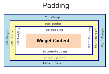
padding Property
This property defines the space between the content of the widget and the widget boundaries. You can use this option to define the top, left, right, and bottom distance between the widget content and the widget boundary.
When you are defining the padding (for any platform) the first time, the value that you enter in the padding field (top, left, right, or bottom) is auto-populated across all the platforms.
The following image illustrates a widget with a defined padding:
Syntax
padding
Type
Array of numbers
Read / Write
Read+Write
Limitations
- Desktop Web/ SPA platforms do not support padding property in Image widget, Slider widget and Switch widget.
- If no skin is applied to a Button, then Padding is not supported on iPhone. This is due to iOS Safari browser limitation. If you want the padding to be applied, apply a skin to the button and then apply padding
Example
//Sample code to set the padding property for widgetID Button widget in frmHome Form.
frmHome.widgetID.padding= [2,2,2,2];
Platform Availability
- Available in IDE
- Android, iOS, Desktop Web and SPA
paddingInPixel Property
This property specifies whether the padding property is to be applied in pixels or in percentage.
Syntax
paddingInPixel
Type
Boolean
Read/Write
Read Only
Remarks
The default value of this property is false.
If the value of this property is true, the padding are applied in pixels.
If the value of this property is false, the padding are applied as set in padding property.
Limitations
Desktop Web/ SPA platforms do not support paddingInPixel property in Image widget, Slider widget and Switch widget.
Example
//Sample code to read paddingInPixel property for widgetID Button widget in frmHome form.

voltmx.print("PaddingInPixel property value is:"+fromHome.widgetID.paddingInPixel);
Platform Availability
- iOS, Android, Desktop Web and SPA.
parent Property
Helps you access the parent of the widget. If the widget is not part of the widget hierarchy, the parent property returns null.
Syntax
parent
Read/Write
Read only
Remarks
Note: The property works for all the widgets inside a FlexForm, FlexContainer or FlexScrollContainer.
Example
function func() {

    voltmx.print("The parent of the widget" + JSON.stringify(Form1.widgetID.parent));

}
Platform Availability
- Not available in the IDE
- iOS, Android, Windows, SPA, and Desktop Web
placeholderSkin Property
This property sets the skin including background and font attributes of the text provided in the placeholderText property.
Syntax
placeholderSkin
Type
String
Read/Write
Read + Write
Remarks
The default color of the placeholder is a white color with 100% opacity.
Example
//Sample code to set the arRenderSkin placeholderSkin property for myARRenderer ARRenderer widget.

frmARRenderer.myARRenderer.placeholderSkin = "arRenderSkin";
Platform Availability
- Android, iOS
placeholderText Property
The placeholder attribute specifies a short hint that describes the expected value of an input field (example, a sample value or a short description of the expected format).
Syntax
placeholderText
Type
String
Read/Write
Read + Write
Example
//Sample code to enable the placeholderText property for an ARRenderer widget.
frmARRenderer.myARRenderer.placeholderText="Click here to scan";
Platform Availability
- Android, iOS
right Property
This property determines the lower right corner of the widget and is measured from the right bounds of the parent container.
The right property determines the position of the right edge of the widget’s bounding box. The value may be set using DP (Device Independent Pixels), Percentage, or Pixels. In freeform layout, the distance is measured from the left edge of the parent container. In flow-vertical layout, value is ignored. In flow-horizontal layout, the value is ignored.
The right property is used only if the width property is not provided.
Syntax
right
Type
String
Read/Write
Read + Write
Remarks
If the layoutType is set as voltmx.flex.FLOW_HORIZONTAL, the right property is measured from left edge of the right sibling widget. The horizontal space between two widgets is measured from right of the left sibling widget and left of the right sibling widget.
Example
//Sample code to set the right property for widgets by using DP, Percentage and Pixels.
frmHome.widgetID.right = "50dp";

frmHome.widgetID.right = "10%";

frmHome.widgetID.right = "10px";
Platform Availability
- Available in the IDE
- iOS, Android, Windows, SPA, and Desktop Web
sceneConfig Property
Using the sceneConfig property, you can set the method of scanning an area.
For example, using the sceneConfig property you can set the method of scanning an area as horizontal or vertical.
Syntax
sceneConfig
Type
JS Object
Input Parameters
sceneConfig property has the following key-value pairs:
anchorType: This parameter defines how a scene must be anchored.
You can assign any of the constants provided in the following table to the anchorType parameter.
Constants Description voltmx.ar.ANCHOR_TYPE_PLANE_ANY Default value. voltmx.ar.ANCHOR_TYPE_PLANE_HORIZONTAL This constant must be used when you want to scan an area from left to right or right to left. voltmx.ar.ANCHOR_TYPE_PLANE_VERTICAL This constant must be used when you want to scan an area from top to bottom or bottom to top. voltmx.ar.ANCHOR_TYPE_FEATURE_POINT This constant must be used when you want to scan an area based on a point on the device screen.
Read/Write
Read + Write
Example
//Sample code to set the sceneConfig property for myARRenderer ARRenderer widget.

frmARRenderer.myARRenderer.sceneConfig = {
 "anchorType": voltmx.ar.ANCHOR_TYPE_PLANE_HORIZONTAL
};
Platform Availability
- Android, iOS
skin Property
Specifies a background skin for a widget.
Syntax
skin
Type
String
Read/Write
Read + Write
Remarks
Note: Transparent skin is not supported on SPA (Windows) platform.
Example
//This is a generic property that is applicable for various widgets.
//Here, we have shown how to use the skin property for ObjectSelector3D widget.
/*You need to make a corresponding use of the
skin property for other applicable widgets.*/
//Defining the properties for ObjectSelector3D with skin:"ObjSkin"
var objBasic = {
    id: "objThreeD",
    skin: "ObjSkin",
    focusSkin: "ObjFSkin",
    text: "Seat reservation",
    isVisible: true
};

var objLayout = {
    widgetAlignment: constants.WIDGET_ALIGN_CENTER,
    padding: [5, 5, 5, 5],
    contentAlignment: constants.CONTENT_ALIGN_CENTER,
    containerWeight: 99,
    margin: [5, 5, 5, 5],
    paddingInPixel: true,
    marginInPixel: true,
    hExpand: false,
    vExpand: false
};

//Creating the ObjectSelector3D.
var objThreeD = new voltmx.ui.ObjectSelector3D(objBasic, objLayout, {});

//Reading skin of the ObjectSelector3D
alert("ObjectSelector3D skin is ::" + objThreeD.skin);
Platform Availability
Available in the IDE.
- iOS, Android, Windows, and SPA
top Property
This property determines the top edge of the widget and measured from the top bounds of the parent container.
The top property determines the position of the top edge of the widget’s bounding box. The value may be set using DP (Device Independent Pixels), Percentage, or Pixels. In freeform layout, the distance is measured from the top edge of the parent container. In flow-vertical layout, the distance is measured from the bottom edge of the previous sibling widget in the hierarchy. In flow-horizontal layout, the distance is measured from the left edge of the parent container.
Syntax
top
Type
String
Read/Write
Read + Write
Remarks
If the layoutType is set as voltmx.flex.FLOW_VERTICAL, the top property is measured from the bottom edge of the top sibling widget. The vertical space between two widgets is measured from bottom of the top sibling widget and top of the bottom sibling widget.
Example
//Sample code to set the top property for widgets by using DP, Percentage and Pixels.
frmHome.widgetID.top = "50dp";

frmHome.widgetID.top = "10%";

frmHome.widgetID.top = "10px";
Platform Availability
- Available in the IDE
- iOS, Android, Windows, SPA, and Desktop Web
width Property
This property determines the width of the widget and is measured along the x-axis.
The width property determines the width of the widget’s bounding box. The value may be set using DP (Device Independent Pixels), Percentage, or Pixels. For supported widgets, the width may be derived from either the widget or container’s contents by setting the width to “preferred”.
Syntax
width
Type
Number, String, and Constant
Read/Write
Read + Write
Remarks
Following are the options that can be used as units of width:
- %: Specifies the values in percentage relative to the parent dimensions.
- px: Specifies the values in terms of device hardware pixels.
- dp: Specifies the values in terms of device independent pixels.
- default: Specifies the default value of the widget.
- voltmx.flex.USE_PREFERED_SIZE: When this option is specified, the layout uses preferred width of the widget as width and preferred size of the widget is determined by the widget and may varies between platforms.
Example
//Sample code to set the width property for widgets by using DP, Percentage and Pixels.
frmHome.widgetID.width = "50dp";

frmHome.widgetID.width = "10%";

frmHome.widgetID.width = "10px";
Platform Availability
- Available in the IDE
- iOS, Android, Windows, SPA, and Desktop Web
zIndex Property
This property specifies the stack order of a widget. A widget with a higher zIndex is always in front of a widget with a lower zIndex.
The zIndex property is used to set the stack, or layer order of a widget. Widgets with higher values will appear “over”, or “on top of” widgets with lower values. Widgets layered over other widgets will override any interaction events tied to widgets beneath. Modifying the zIndex does not modify the order of the widgets in the Volt MX Iris hierarchy, inside of a flexContainer or form. The zIndex property accepts only positive values.
Syntax
zIndex
Type
Number
Read/Write
Read + Write
Remarks
The default value for this property is 1.
Note: Modifying the zIndex does not modify the order of the widgets inside the FlexContainer. If zIndex is same for group of overlapping widgets then widget order decides the order of overlapping. The last added widget is displayed on top.
From Volt MX Iris V9 SP2 FP7, developers can configure the Z Index value for a Responsive Web app as Auto or Custom. When the selected Z Index value is Auto, the default Z Index value of 1 is applied. When the selected Z Index value is Custom, developers can specify a desired numeric value.
Prior to the V9 SP2 FP7 release, the default value for the Z Index was 1. When developers imported any third-party libraries with the Z index set as Auto, content overflow was disabled as the value of Auto is less than 1.
Note: The Z Index value Auto is supported only when the Enable JS Library mode is configured as unchecked.
For existing components, the value of the Z Index is configured as 1 for the Native channel. For the Responsive Web channel, the Z Index will be set as Custom with 1 as the value.
For new components, the value of the Z Index is configured as 1 for the Native channel. For the Responsive Web channel, the Z Index will be set as Auto or 1 based on the project level settings.
Note: If ModalContainer property is set to true in any of the FlexContainer widget, the Z Index value of that container and all of its parent containers should be set to Custom.
voltmx.flex.ZINDEX_AUTO : Constant to configure the Z Index value as auto programmatically.
//Sample code to set the ZIndex value to Auto
 var flx = new voltmx.ui.FlexContainer({
  "id": "flx"
  "zIndex": voltmx.flex.ZINDEX_AUTO
});
//Sample code to set the ZIndex value to Auto
flx.zIndex = voltmx.flex.ZINDEX\_AUTO;
Example
//Sample code to set the zIndex property for widgets.
frmHome.widgetID.zIndex = 300;
Platform Availability
- Available in the IDE
- iOS, Android, Windows, SPA, and Desktop Web